Week 10: Grid Layouts
Task 5: Grid Layout Analysis
Art/Edit interior design magazine is an Australian design magazine. It helps readers find, place and live with art in their homes. Issue 31 will be analysed to understand how grid layouts have been used throughout the publication.
What typefaces were used? How do they relate to the function/message?
- The spread uses a single geometric sans serif typeface used in bold and thin forms. There is a consistent line leading used through the body text and consistent kerning aside from the slug which has positive kerning.
- This relates to the context of an art/interior design magazine as it is a simple and modern typeface that allows the interesting content to stand out.
What is the hierarchical structure and what were the markers used?
- The main headings are in bold all caps and an increased size
- The stand-first is in an increased size and spacing
- Paragraph headings/ questions from the interview are in bold
- Slug is in all caps to attract attention and in regular thickness
- The folio is in regular thickness and an increased size from the main text
- In terms of overall hierarchy, the images were given prominence by placing them at the top of the page.
What kind of grid was used (single-column, multi-column, modular, baseline, other)?
- This spread uses a multi-column grid layout. There are 5 main columns that make up the space inside the margins.
- The inside margins are slightly wider than the outside margins
What elements determined the grid structure?
- The body copy on the first page was the first element that stood out however it was not an even 2 or 4 column ratio as there was a segment left on the side.
- The box element on the bottom left corner of the first page in the spread was a determining factor in figuring out that it was a 5 column grid as it equally fitted twice within the space of the body copy.
- Finally, no consistent horizontal lines were found meaning the grid was not modular. However, there was an anchor or white space found at both the top and the bottom of the page.
How do you think the design works overall? What could be improved?
- The design is very minimalist overall which is effective in the context of the art which is shown.
- The 5 columns is an abstract take on a simple 2 or 4 column grid, and allows space for extra information which works well in this context where there are lots of different bits of separate information - the questions, the answers, the contact info, the images and then their captions. The design is also abstract in the way that many of the elements cover 2 or more of the columns, creating more variation of size and alignment.
I think there could be more visual hierarchy between the heading, the stand-first and the questions vs answers to help readers get an understanding of the text.
Task 6: Healthy Body at Uni Pamphlet

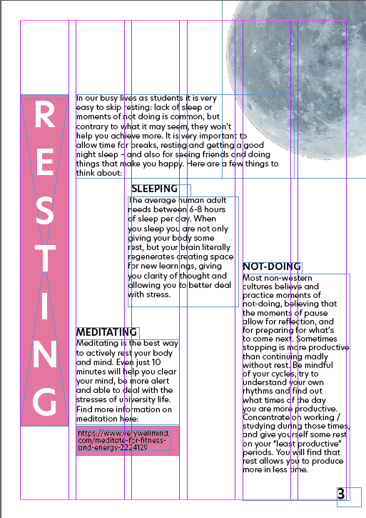
Task brief: to create a pamphlet using supplied text educating university students on keeping their bodies healthy on a low budget. We could only use one piece of A4 paper in the design and had to choose a grid layout that made sense to the task.
I chose to use a 6 column grid which allowed me to create variation between large sections of body copy, where I used up to 2 columns wide to spread the text, and singular elements or titles where they only took up 1 column.

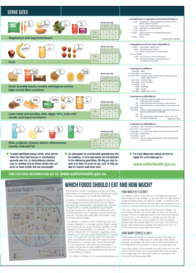
Research of pre existing healthy eating pamphlets

Thumbnails

