Week 9: Document Design and Conference Lineup
Task 1: Magazine critique and redesign
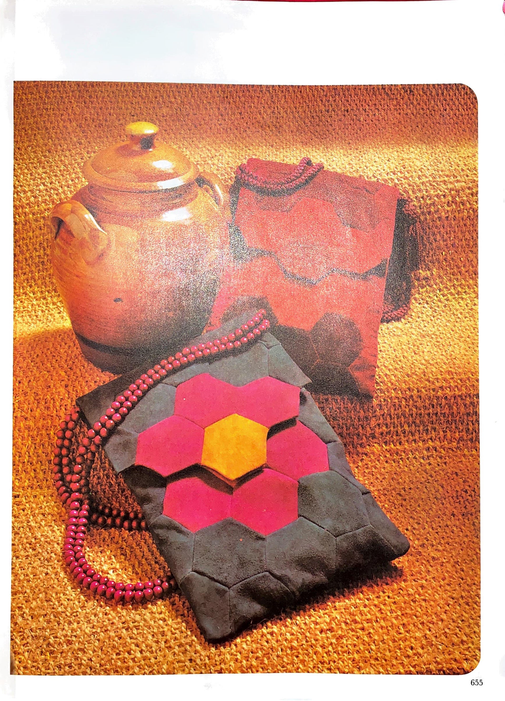
What is the structure of the content (main titles, subtitles, times/dates, menu, contact information, news text, body text, etc)?
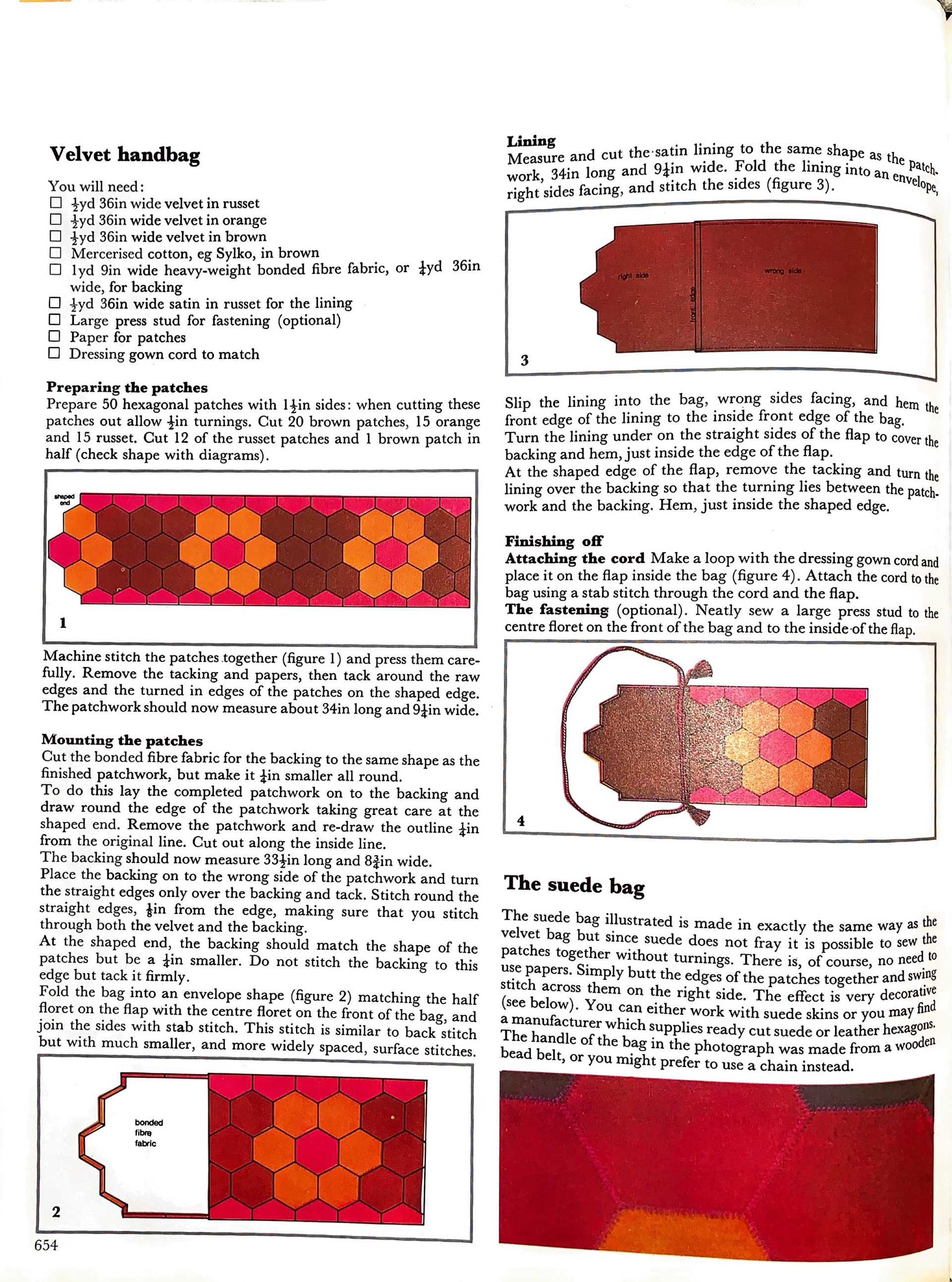
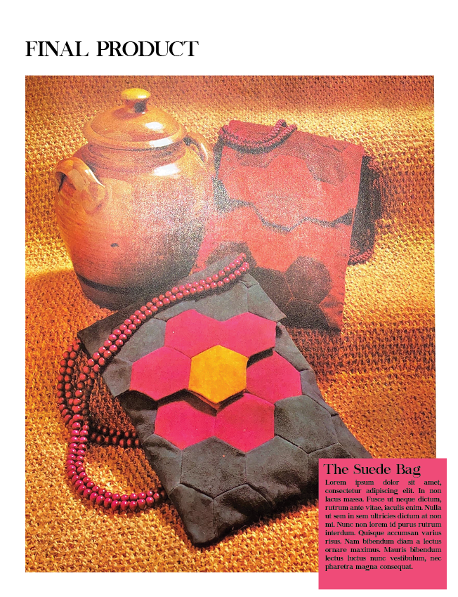
This spread is from a vintage knitting and DIY magazine called Golden Hands. On the left hand page is the body text (instructions) and on the right hand page is a large image of the final product. Focusing on the left hand page there is firstly the title of the content - Velvet Handbag. The body text is split into two columns. Working left to right, top to bottom, there is a list of things required to make the bag, indented and marked which checkboxes. Then there are several sub headings dictating different parts of the bag making process such as ‘mounting the patches’ or ‘finishing off’. Throughout the content are several illustrations showing the process which have boxes around them and are numbered. There are small annotations on these illustrations, showing specific details like ‘right side’ and ‘wrong side’. Finally at the bottom of both pages in the spread is a page number, aligned with the outer edge of the content.
What resources did the designer use to visually represent the structure of the content, to create a visual hierarchy on the page (typeface, position, scale/size, weight, colour, contrast, orientation)?
- Main headings are in a bold version and larger size of the typeface to indicate importance and attract the eye, additionally the headings have spacing after them.
Subheadings are the same size as body copy but are bold, unlike the main headings they do not have spacing after them.
- To allow breathing room, paragraphs have spacing after them.
- The numbers in the images are the same as the main headings (bold and larger size) which increases visibility and allows them to not drown in the negative space.
- Page numbers are the same formatting as body text so they do not get lost but also are not a distraction to the content (Bringhurst, R. 2004)
- The page size follows a 3:4 ratio which aligns with the fourth interval in music notation and is deemed one of the perfect page ratios used in the European middle ages (Bringhurst, R. 2004). Being a magazine produced in London, it makes sense that the page ratio would follow the cultural and historical norms there.
What do you think works? What doesn't and why?
What works:
- The pages are simply sectioned and there is only one typeface used throughout the whole spread. This works well for a complicated sewing DIY, allowing the bright coloured photos to stand out and do the work that the words cannot.
- Both pages are symmetrically full with content, one being an image and one being fully text. This makes it visually appealing for viewers and helps them digest the large amount of text.
- The spacing at the top and sides of the page is sufficient to still show all the content despite the book being quite large and it not lying completely flat when opened.
What does not:
- The headings are confusing and do not provide flow around the page. This is because some headings are formatted slightly differently so it is hard to understand which are subheadings and what is simply important information (‘Finishing off’ vs ‘preparing the patches’?)
- The illustrations have no relevance to the text that surrounds them. They are numbered which provides order but it confuses the reader as they may think that there are only 4 steps.
Redesign Iterations
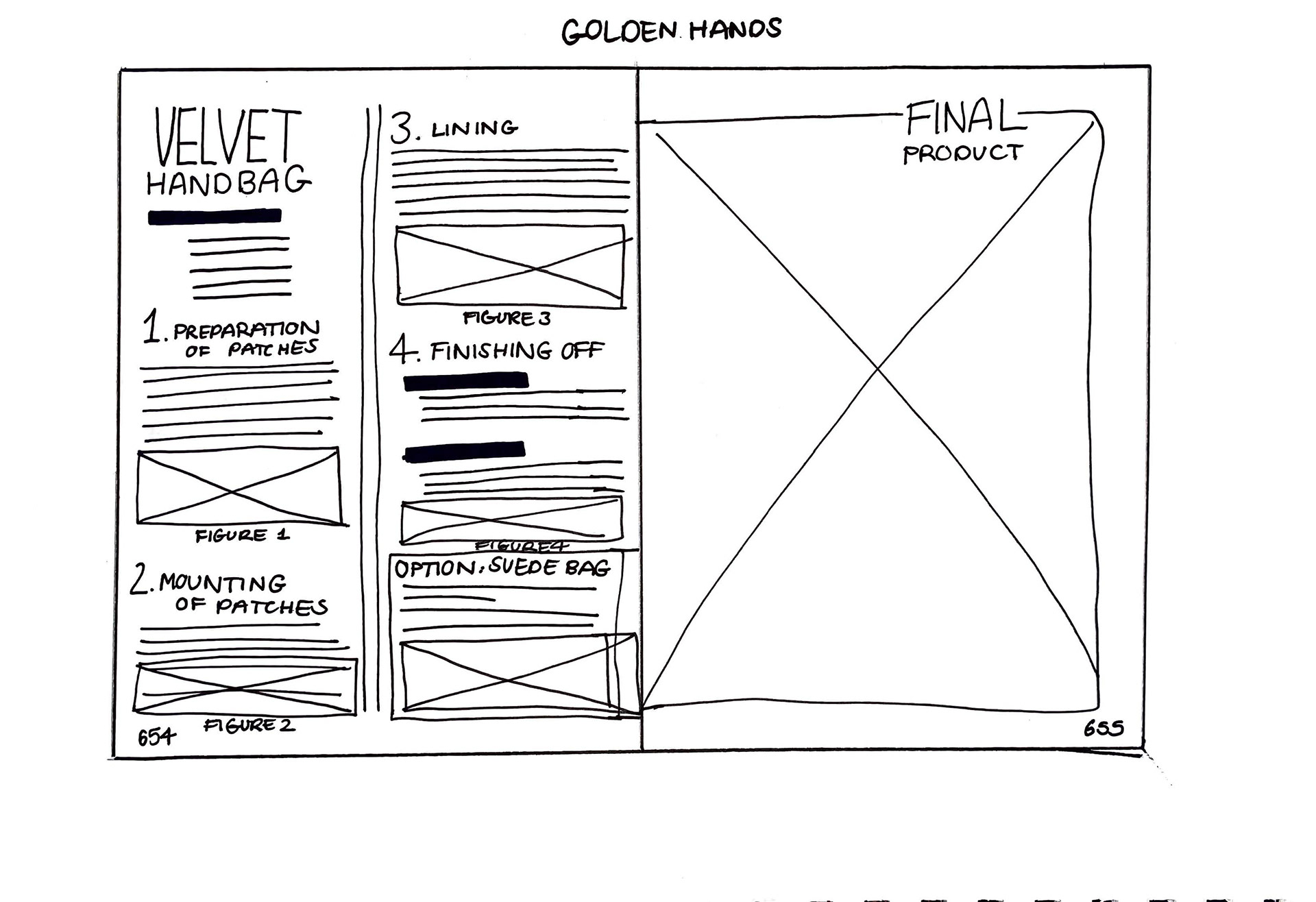
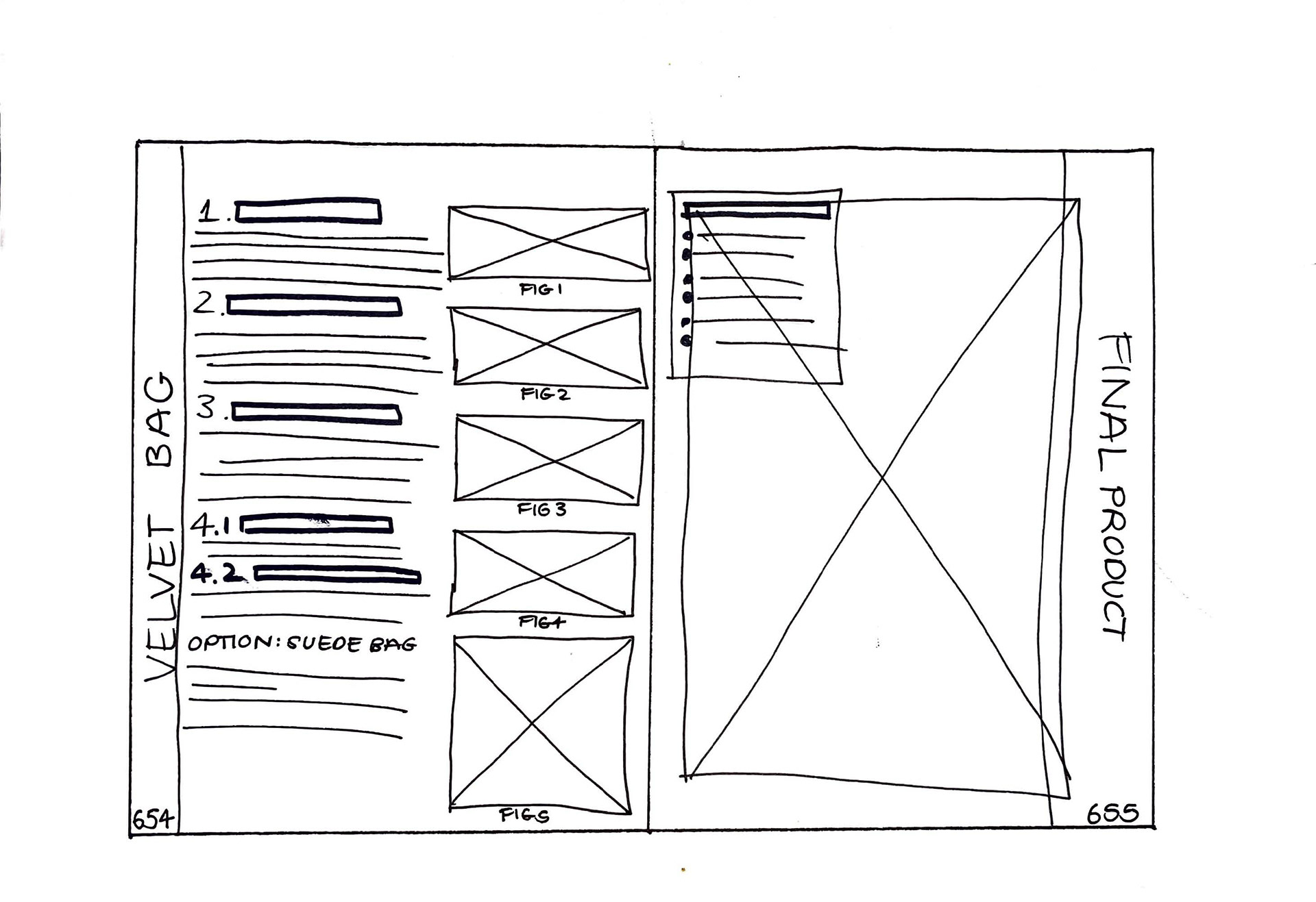
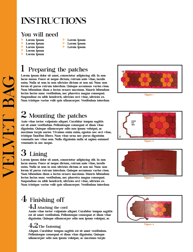
Final Redesign
Conference Lineup
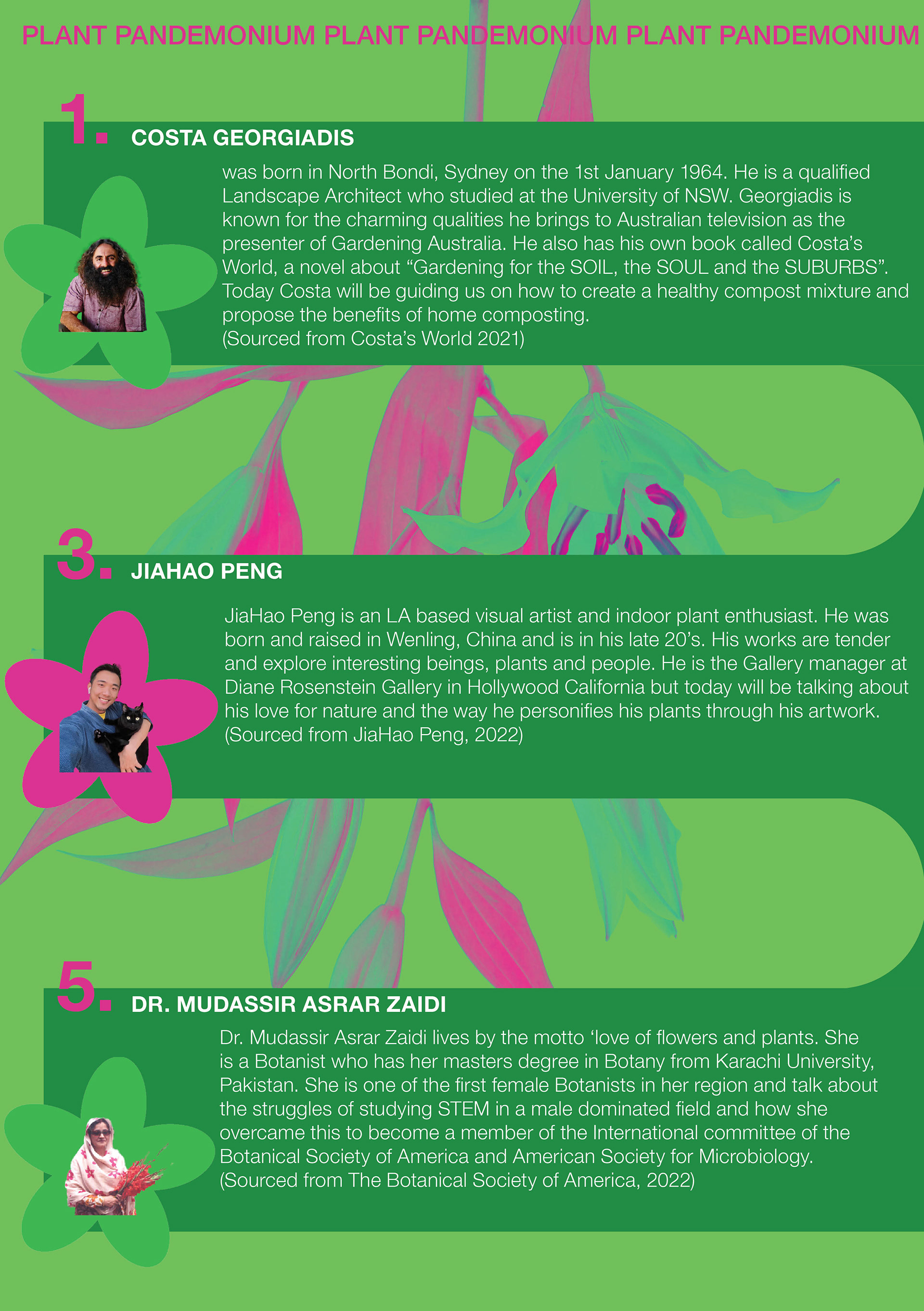
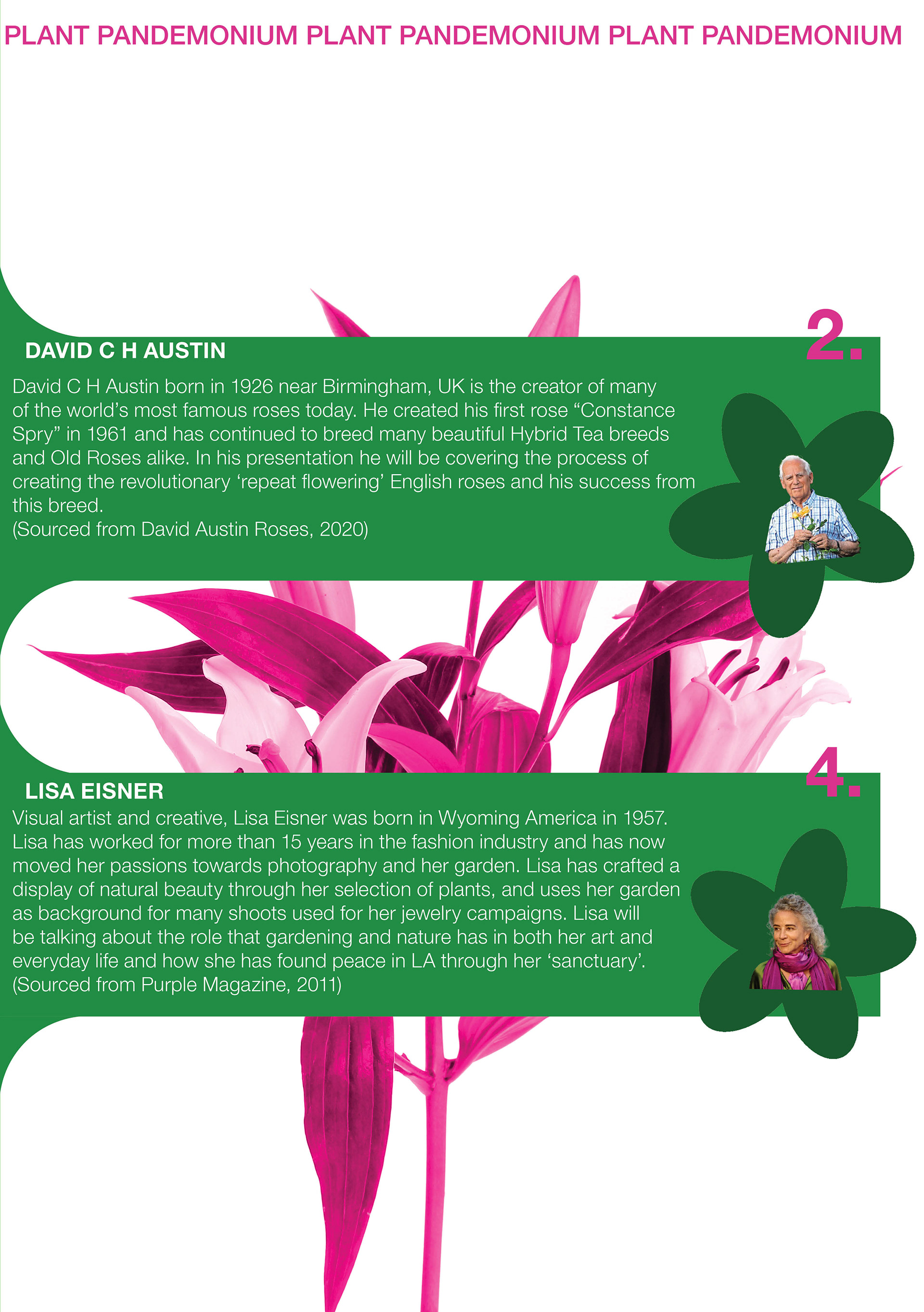
Plant Pandemonium
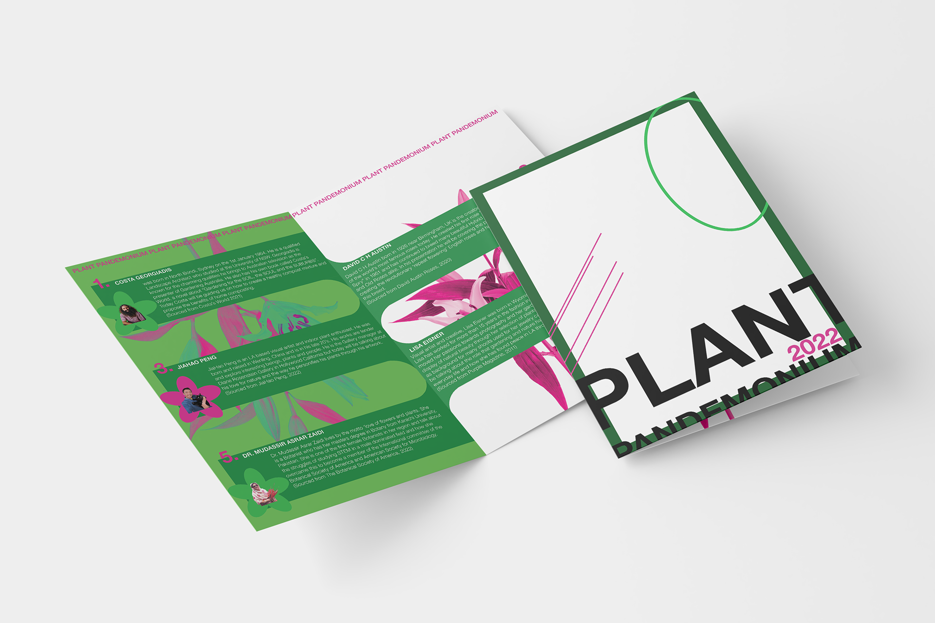
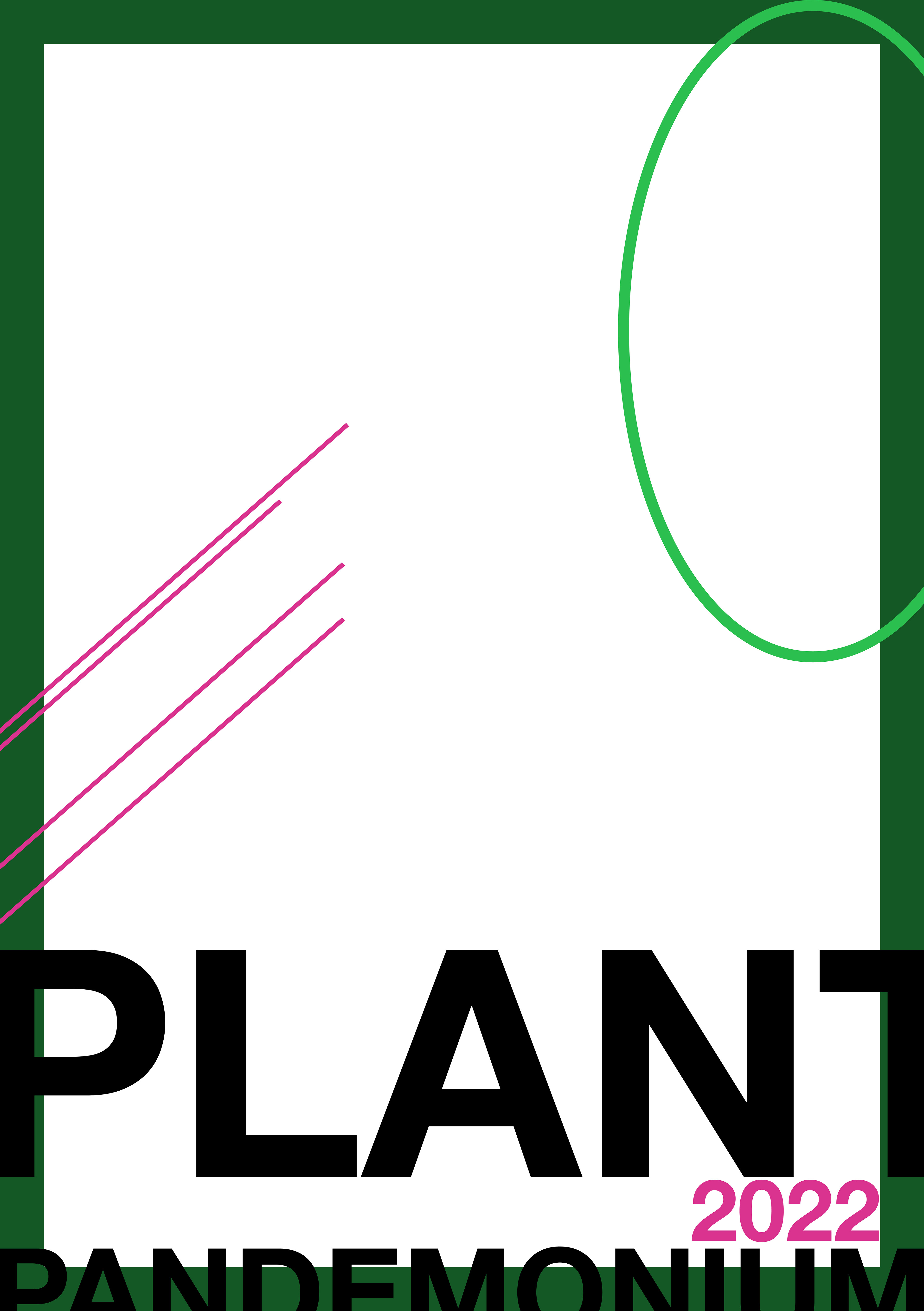
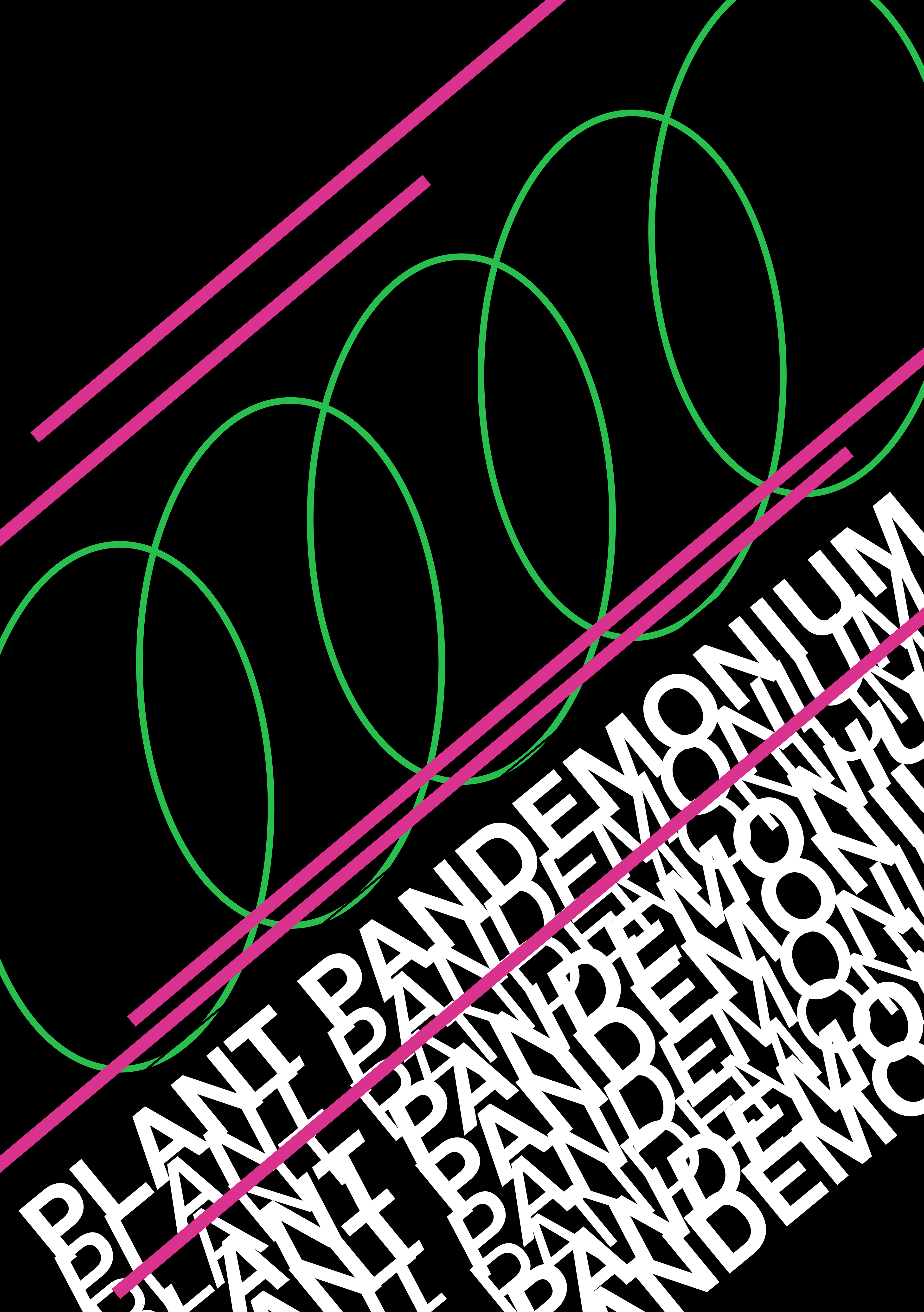
Plant Pandemonium is a conference held in the Eden Project Domes in Cornwall England. It promotes understanding of plants, wellbeing and how the two can come together to promote creative practices. The conference booklet is designed to replicate this creative vision in a modern and experimental way. According to Robert Bringhurst in The Elements of Typographic Style “reading involves navigation”. If reading involves navigation then I must design a map that helps the reader navigate the text in a way that makes sense. I did this in my booklet design through visual hierarchy, colour and symmetry.
I used visual hierarchy in the headings such as “COSTA GEORGIADIS” through increased text size, the use of all caps and a bolded version of the main typeface.
Colour was used to differentiate the numbers from the main text. This ensures that the viewers know the order in which the speakers are presenting and breaks up the largely green design.
Finally, the symmetry and smooth green segments visually guide the reader through the text, to furthermore ensure they read the booklet in the correct order.
I created this design using InDesign paragraph styles to ensure consistency across the booklet. I redefined the Basic Paragraph settings to create my copy text settings, making sure to change the hyphenation settings so that my text wasn’t hyphenated and was easy to read. For the headers I changed the basic paragraph to 14pt and boldface. All other typographic styles, such as those on the back cover, were for visual effect only.
References
The Botanical Society of America. (2022). Dr. Mudassir Asrar Zaidi, University of Balochistan Quetta, Pakistan.
Retrieved from https://cms.botany.org/home/careers-jobs/careers-in-botany/botanist-profiles/a-love-of-flowers-and-plants.html
JiaHao Peng. (2022). About. Retrieved from https://jiahao-peng.com/about
Bringhurst, R. (2004). The elements of typographic style. Hartley & Marks.
David C H Austin. (2022). Retrieved from https://www.davidaustinroses.com/pages/david-c-h-austin
Growing happiness starts in the compost with Costa Georgiadis at Happiness & Its Causes 2014. (2021, August 20). Retrieved from https://costasworld.com.au/growing-happiness-starts-in-the-compost-with-costa-georgiadis-at-happiness-its-causes-2014/
Purple Magazine. (May 2011). Lisa Eisner's Garden. Retrieved from https://purple.fr/magazine/fw-2011-issue-16/lisa-eisner/
