Week 11: Zine Research and Planning
Zine Examples
Example 1: The Fundamental guide to Apologising - Three Day Studio
The Fundamental Guide to Apologising is a zine using predominantly typography to help others convey a ‘sincere apology’ by ThreeDay Studio. The Zine uses negative space in a way that allows the many typefaces to breathe and have a voice of their own. In this way, each typeface has relevance to the topic being talked about on that page, bringing further meaning to the already meaningful text. For example on the first page there is a handwritten typeface explaining why the artist felt the need to make such an intimate zine. The creator also uses hierarchy to convey to the reader the most important content, for example all headings are extremely large and in all caps, with most body text and larger paragraphs in all lowercase. Finally, the typographic forms have been presented in a unique way to emphasise or add meaning to them. For example on the Do’s and Don’ts page, the Do’s are underlined while the Don'ts have a strikethrough. Overall this zine is effective at portraying an intimate topic, adding meaning through creative use of typography and space.
Example 2: I didn’t know we hate comic sans - Felicia Melawi
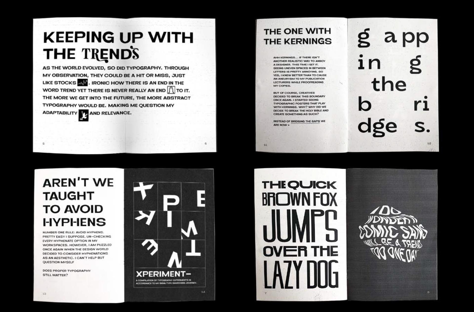
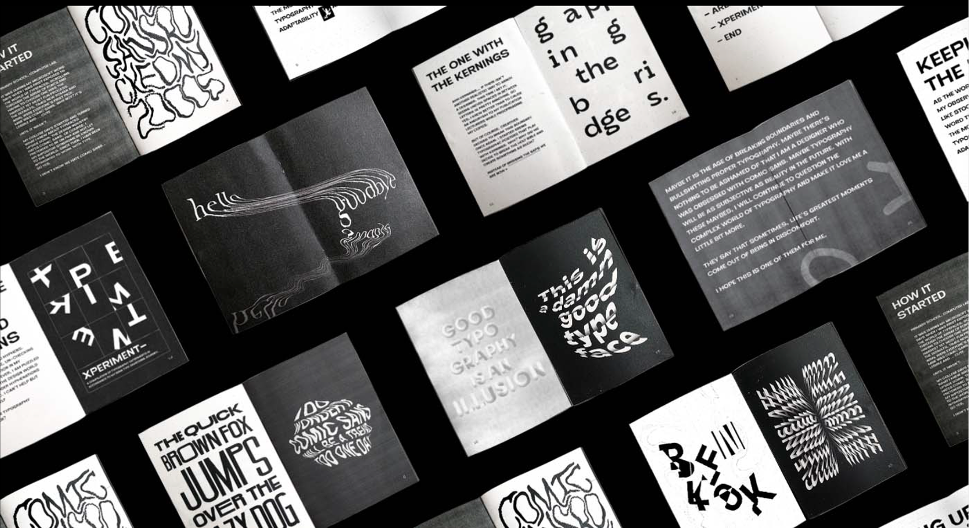
I Didn’t Know we Hate Comic Sans by Felicia Melawi is an expression of the confusion that the typographic world can lead to, where so many rules are both strictly enforced and broken within a page. This Zine is entirely monochromatic and typographic but is still unique and interesting. Felicia has done this through her use of experimental typographic shapes, exemplifying the exact problem she is talking about. For example on the spread about kerning she uses kerning to create abstract word forms. An interesting part about this Zine is its grid layout, or rather lack of one. All pages use singular column text blocks, and the columns range from being one page wide to the size of an entire spread. This along with the consistent margins allows the content to shine and juxtaposes with the more creative forms throughout the zine. Overall I was impressed by the creativity of this zine despite it’s simplicity of typeface and colours.
Example 3: I’m so F***ing tired of Helvetica - Andrea Bianchi
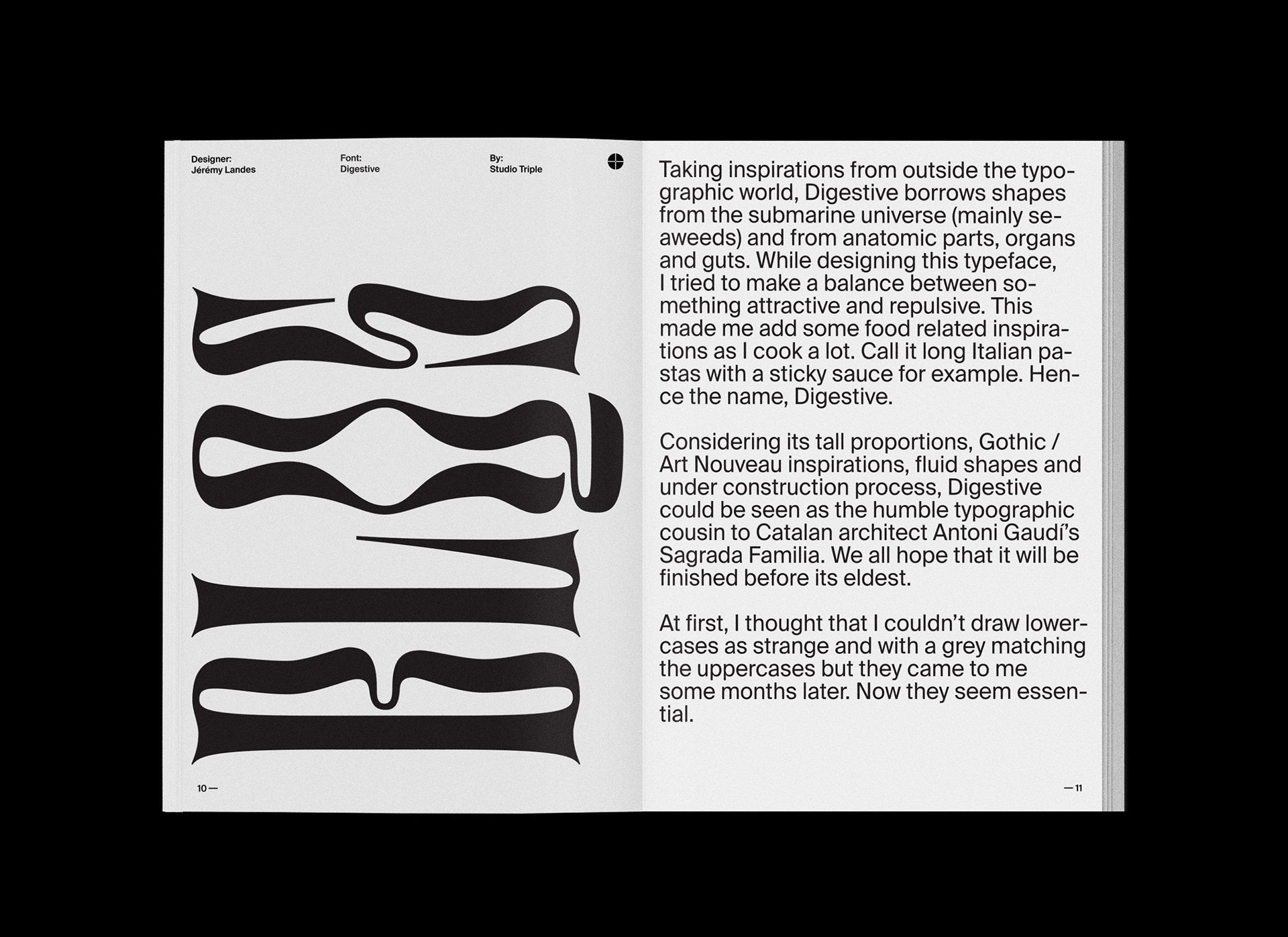
I’m so F***ing Tired of Helvetica is a Zine by Andrea Bianchi on the topic of typographic trends and typography as an artform. Throughout the Zine Bianchi presents several typefaces as alternatives to the ‘flatness’ of Helvetica. There are spreads where the typefaces are shown in a zoomed in form to show off their unique and beautiful shapes. In terms of grid layout the production swaps between a single column block text to a modular 3 x 4 grid for pages with typographic forms and images showing the typefaces in context. Despite the large sections of body text, the zine maintains readability through a consistent left alignment and the use of a sans serif text (ironically Helvetica) at a large size. Hierarchy is presented through the use of alignment and orientation as all the headings are bottom align up the left side of the page. All body test is a consistent size and then finally all captions or small text is at a smaller size. Overall, I like the simplicity of this Zine and it’s consistent application of a grid and text forms to make an easily understandable Zine.
Zine Planning
Key Ideas from Monotype Trends Report 2022
- We’re coming out of the pandemic and returning to nature
- We’ve come out of this crazy period where time didn’t feel real
- Now we’re returning to the solidity of nature and exploring our world
- Art Nouveau was a response to the industrial revolution where technology was overtaking craftsmanship
- Alphonse Mucha
- Quote: What is it, Art Nouveau?... Art can never be new.
- It was reginited in the 60’s as a response to traditionalism and was in more psychedelic forms
- Why are we so obsessed with the 60’s? (Sheridan and Co) https://www.sheridanandco.com/news/why-we-are-obsessed-with-the-sixties/
- The 60’s resonate with our power to be politically active and change the world
- Antiestablishmentarianism paralleled today where the young people are restless
with their leaders and are waiting for the world to change.
- It is a focus on wellness and mental health and freedom seeking attitudes
- Neue Nouveau is a type style with organic forms and psychedelic legibility challenging shapes
- It is a response to the rapidly online world where pixels make up our life
- Neue Nouveau is the response to the world’s obsession with wellness, conspicuous consumption
- Neue Nouveau as the new greenwashing?
