Task 8: Typography Zine
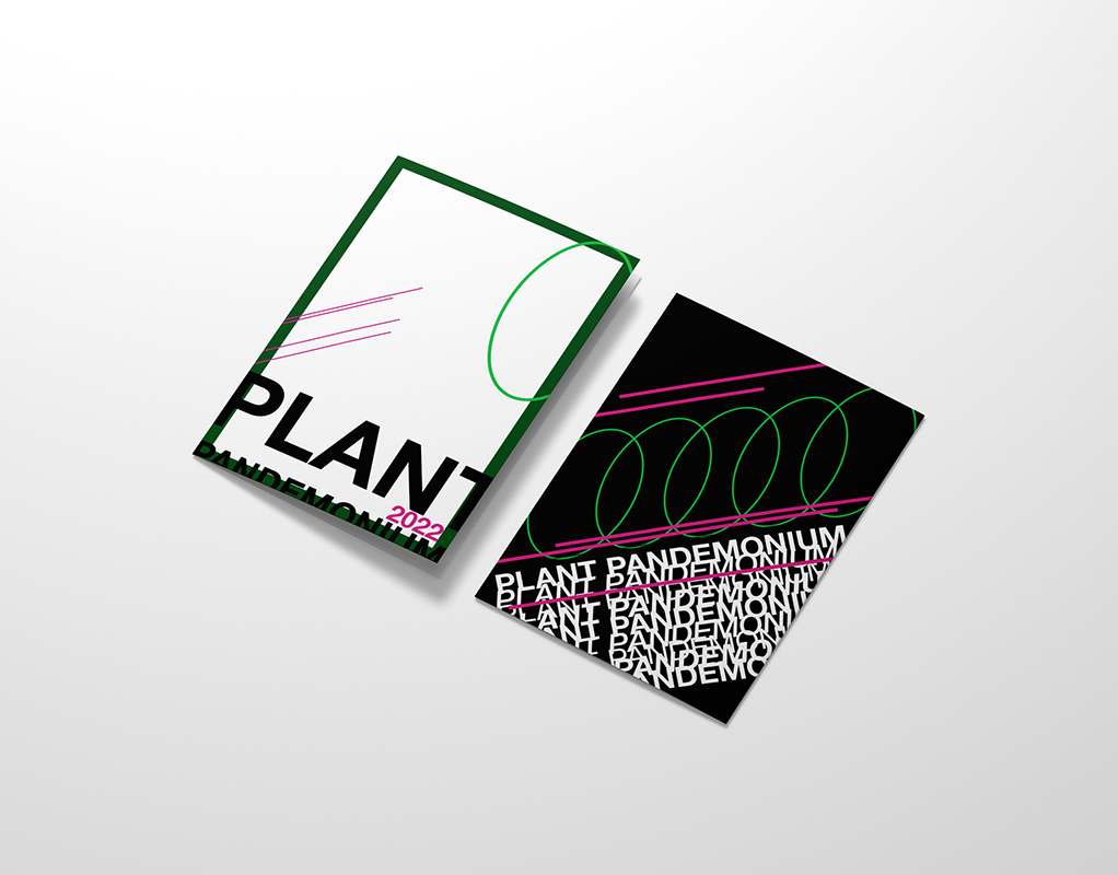
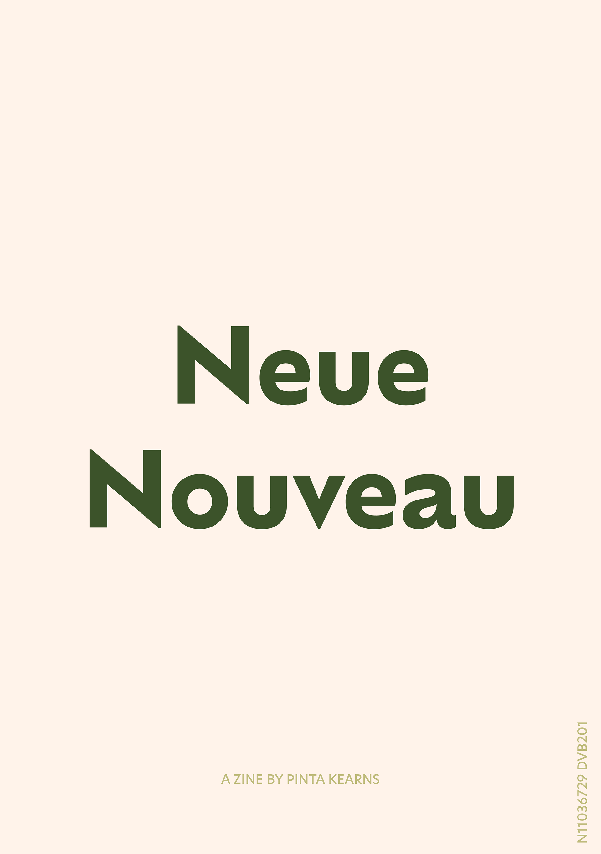
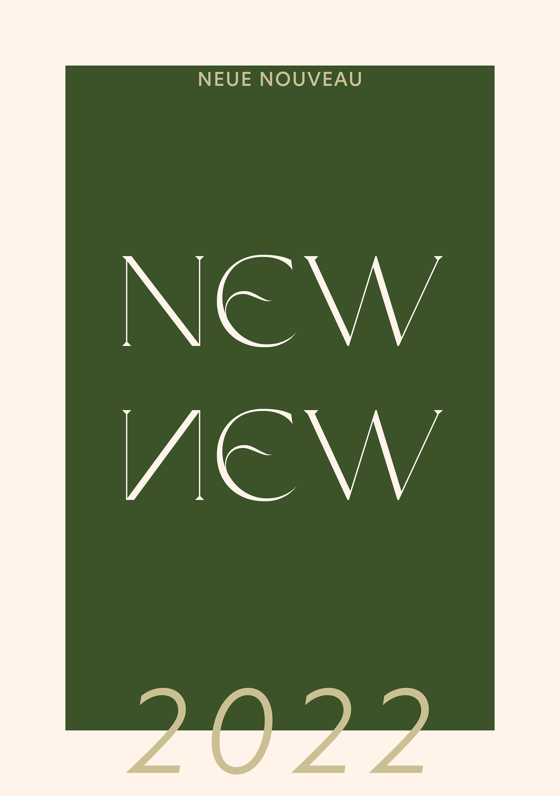
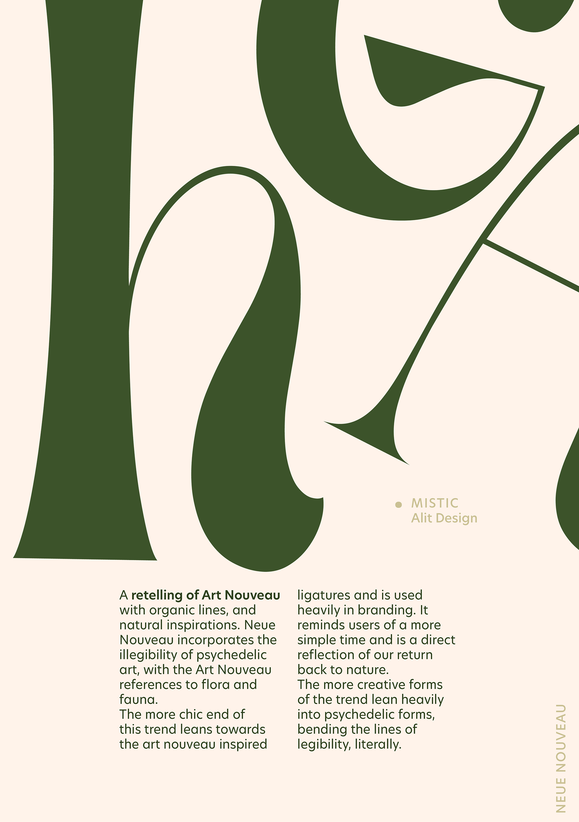
Neue Nouveau is a zine about the typographic trend Neue Nouveau - a recreation of Art Nouveau and Psychedelic Art styles. Based off the MonoType 2022 Trend report, this zine explores the historical and social reasons for this typographic trend.
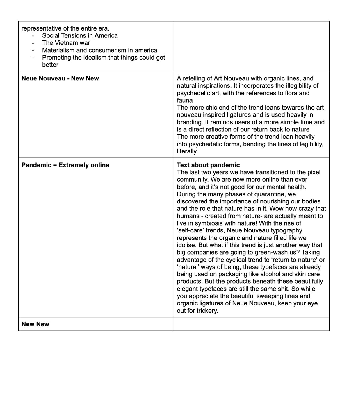
Task 8.1 - Zine Content Planning
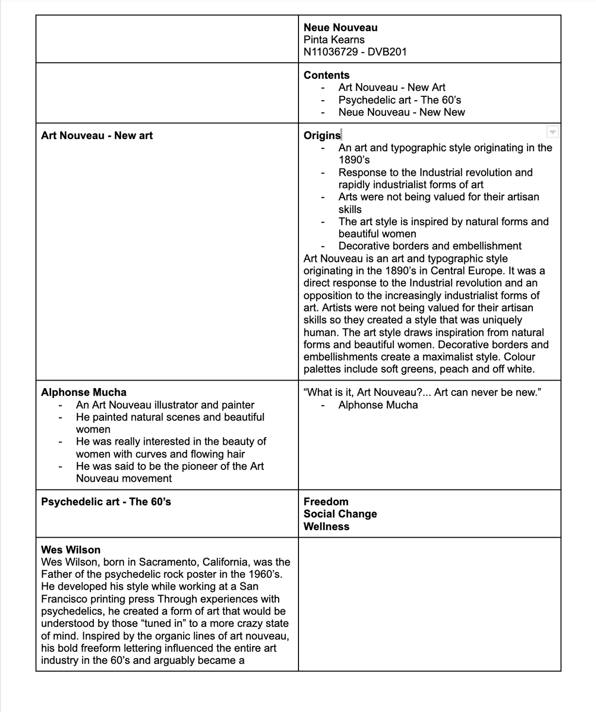
Task 8.2 - Zine First Draft
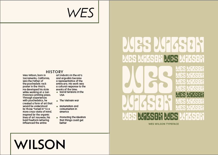
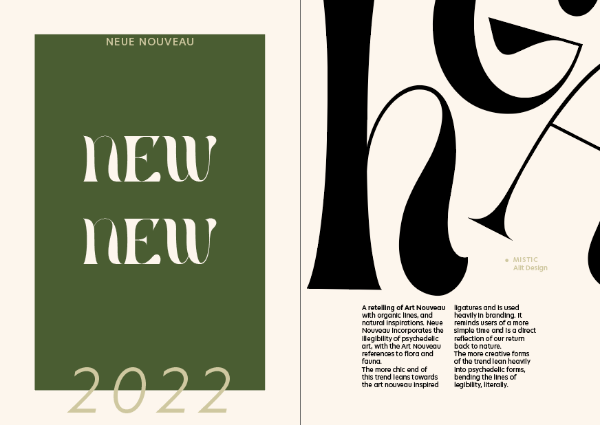
After my first draft I noted a few things to improve
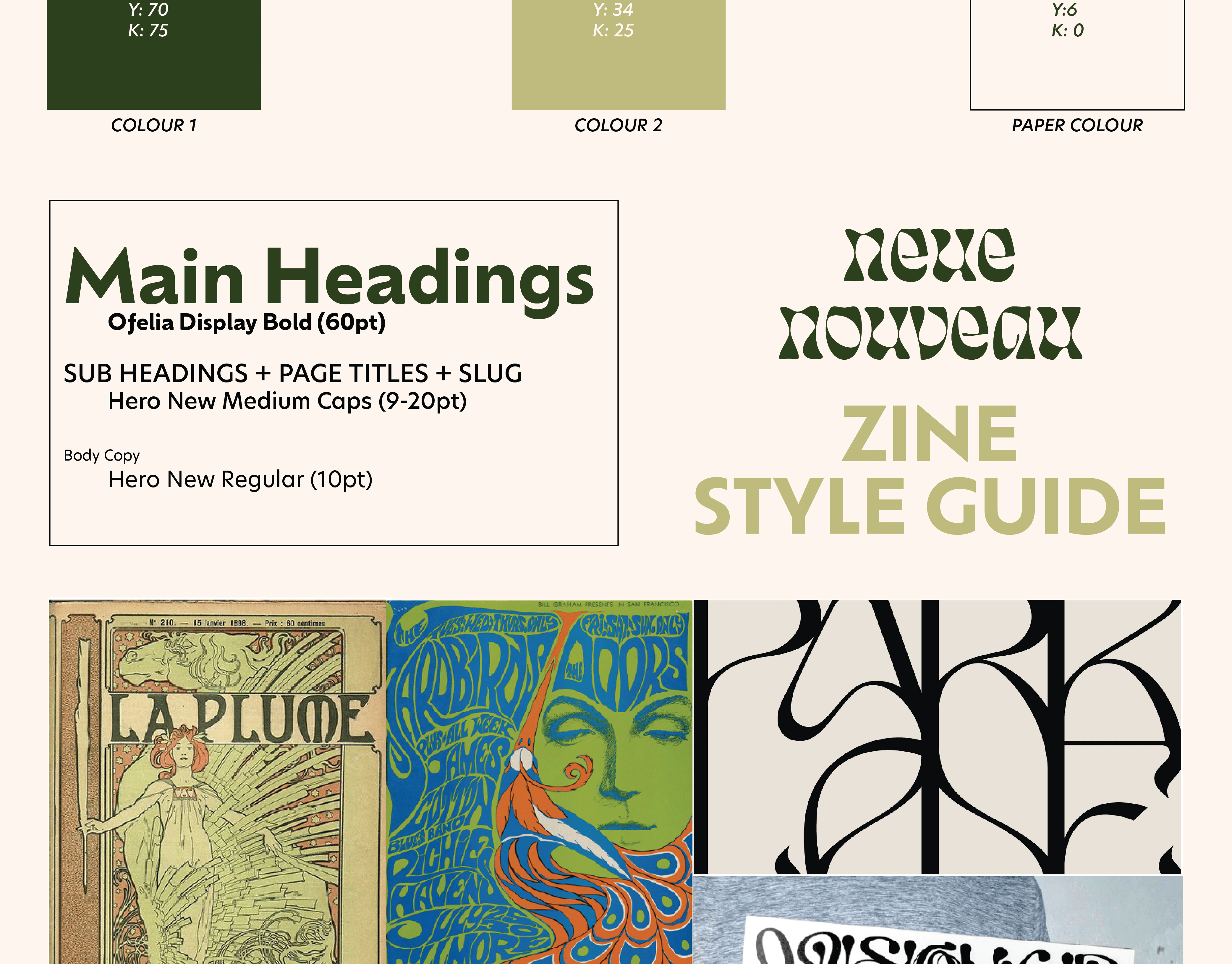
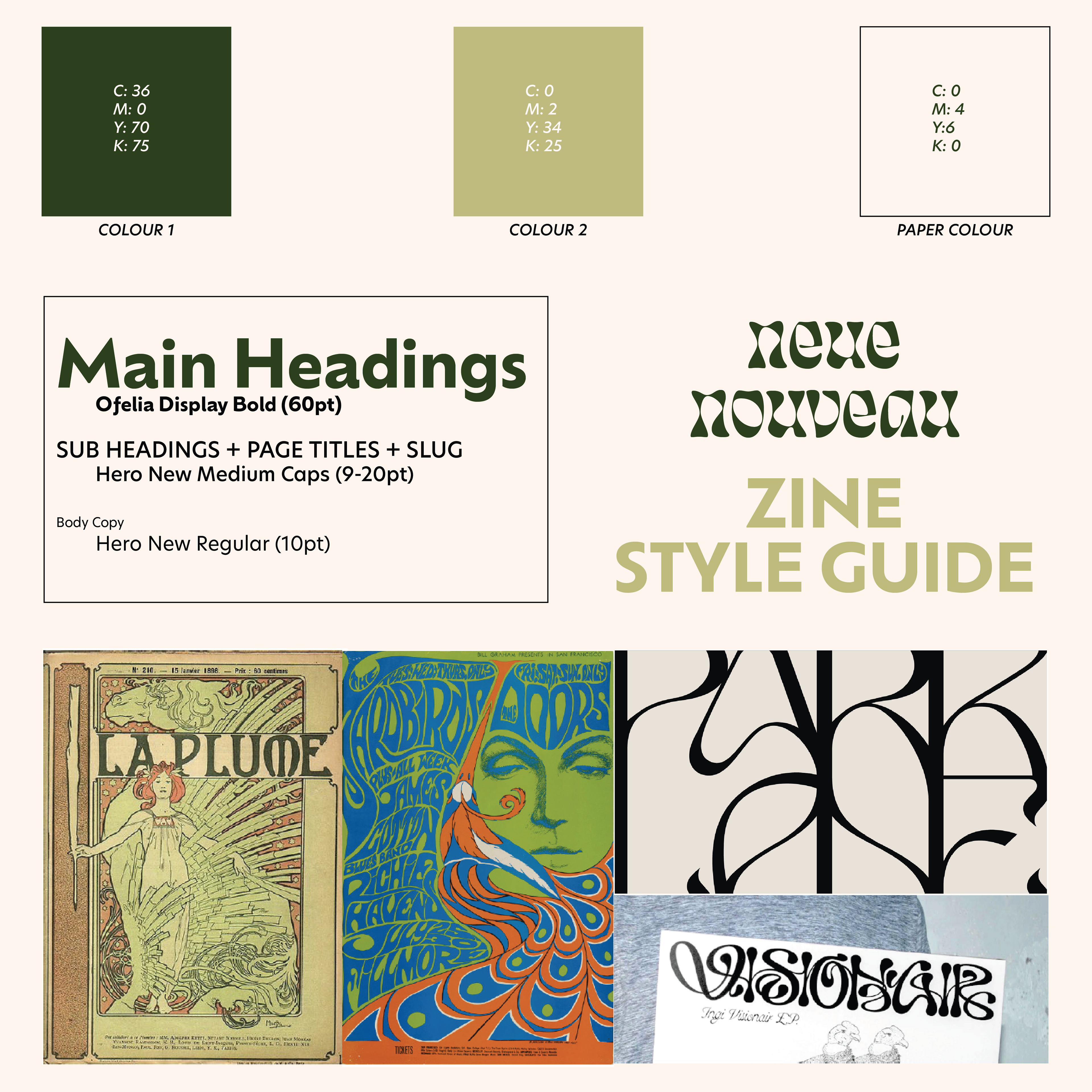
1. The brief called for only 2 colours to be used not including the paper colour however I was using three colours. I changed most of the black elements to the dark green colour.
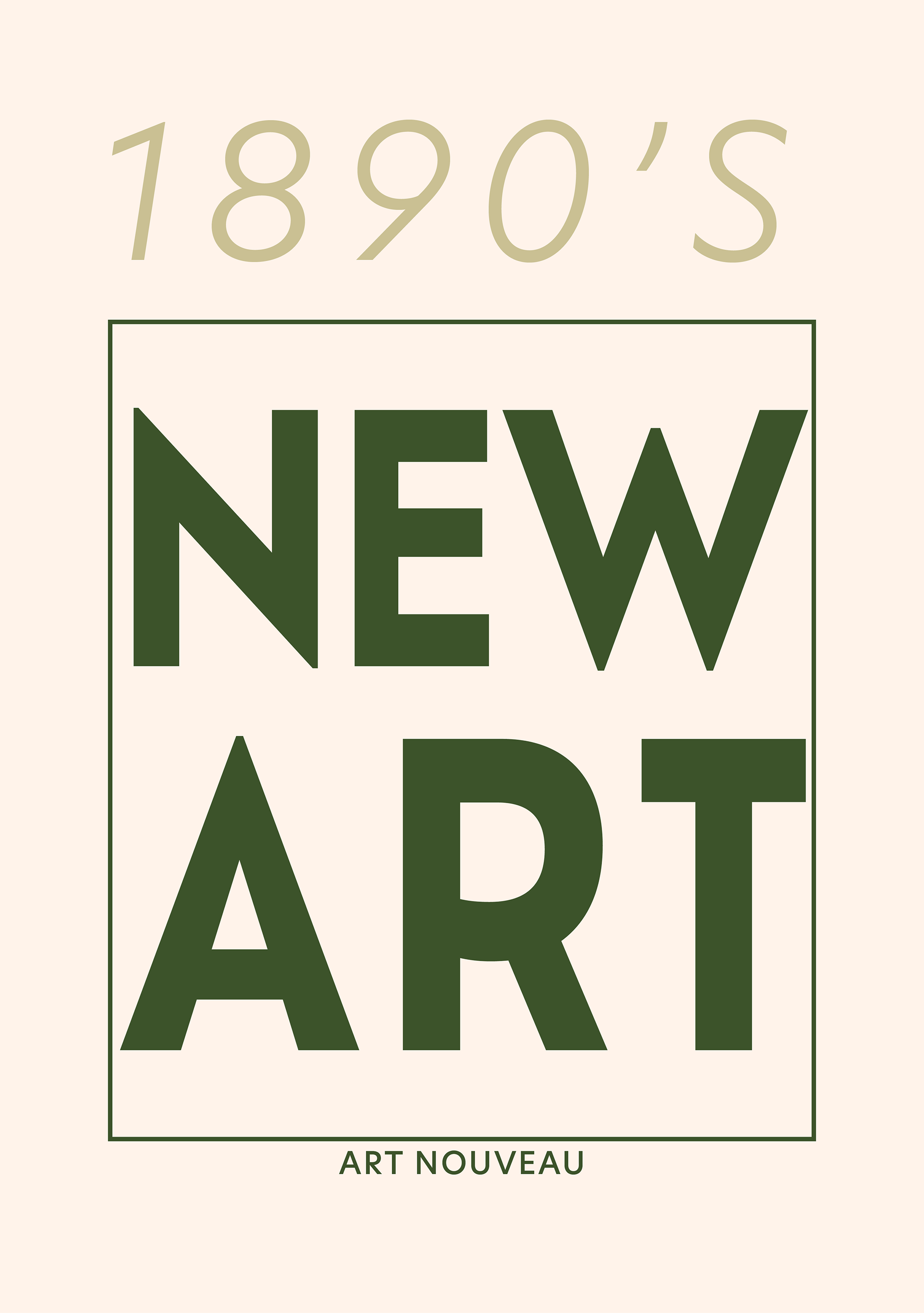
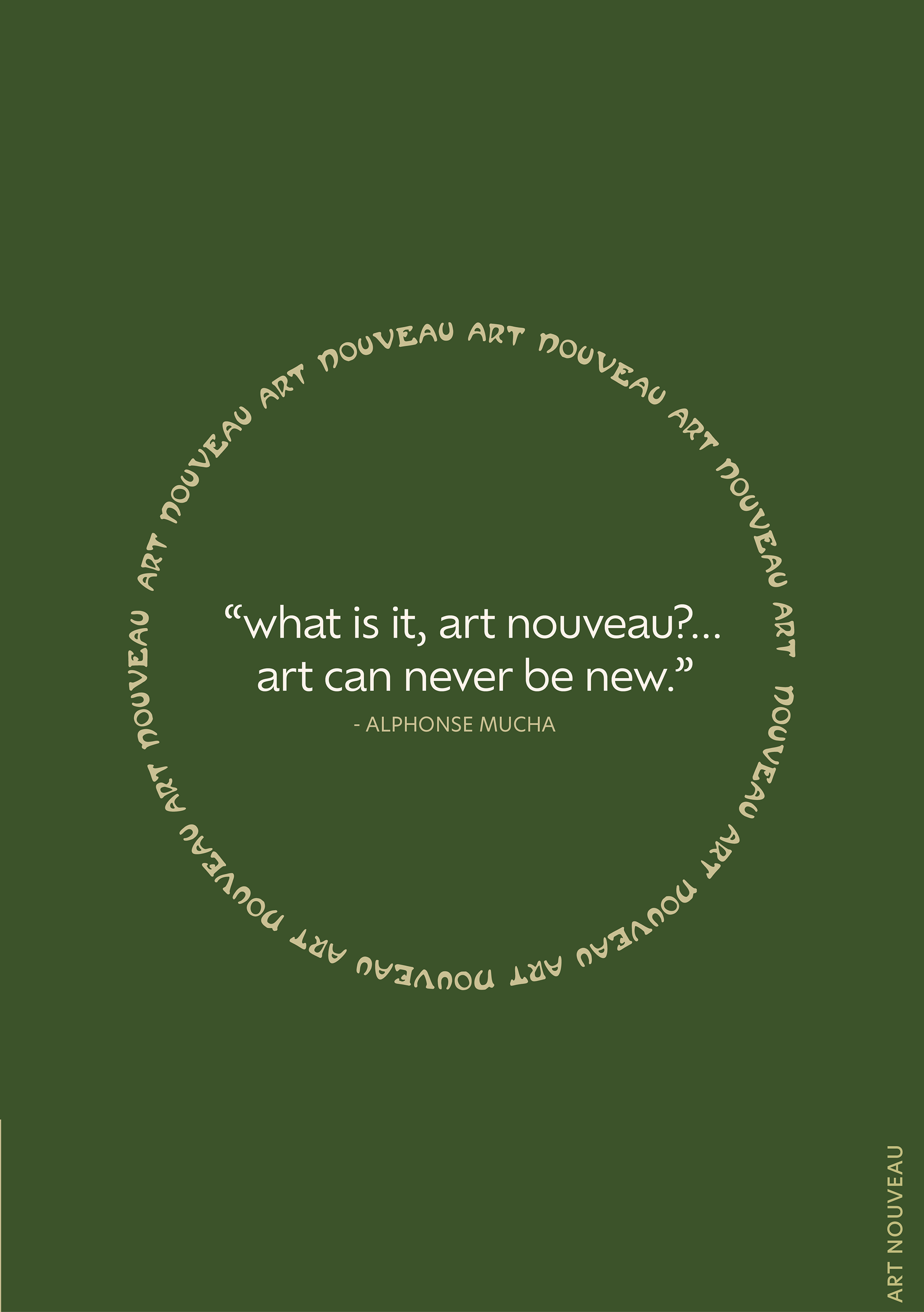
2. I wanted to incorporate more examples of the typefaces associated with each art style. To do this I changed the NEW NEW heading to a more clear example of Neue Nouveau and added an example of Art Nouveau.
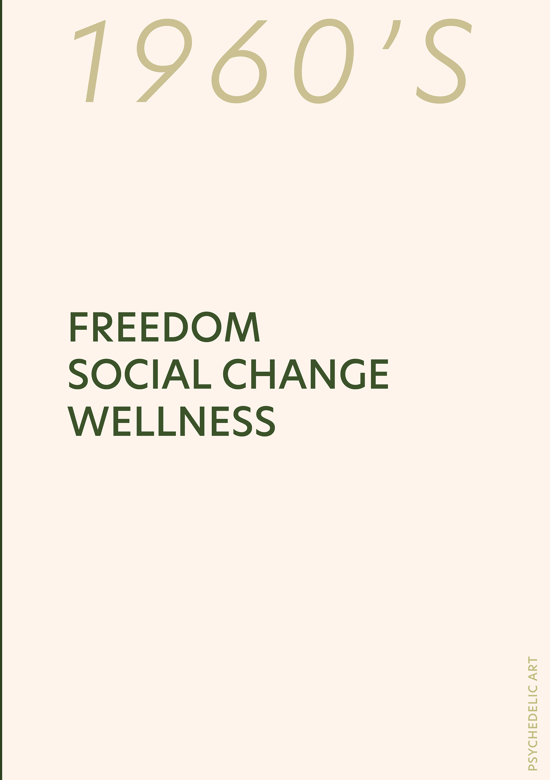
3. I felt it was important for readers to understand the 'chapter' they were reading so I added a folio on the right hand pages of each spread.
Task 8.3 - Final Zine Design

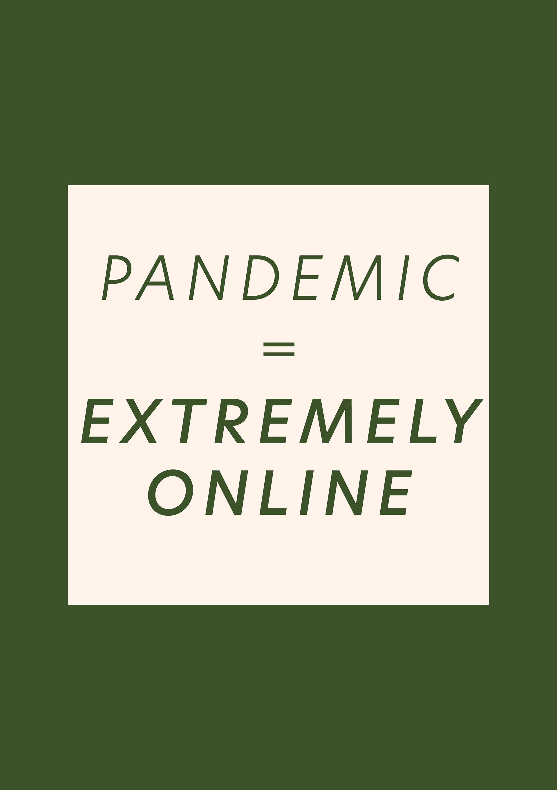
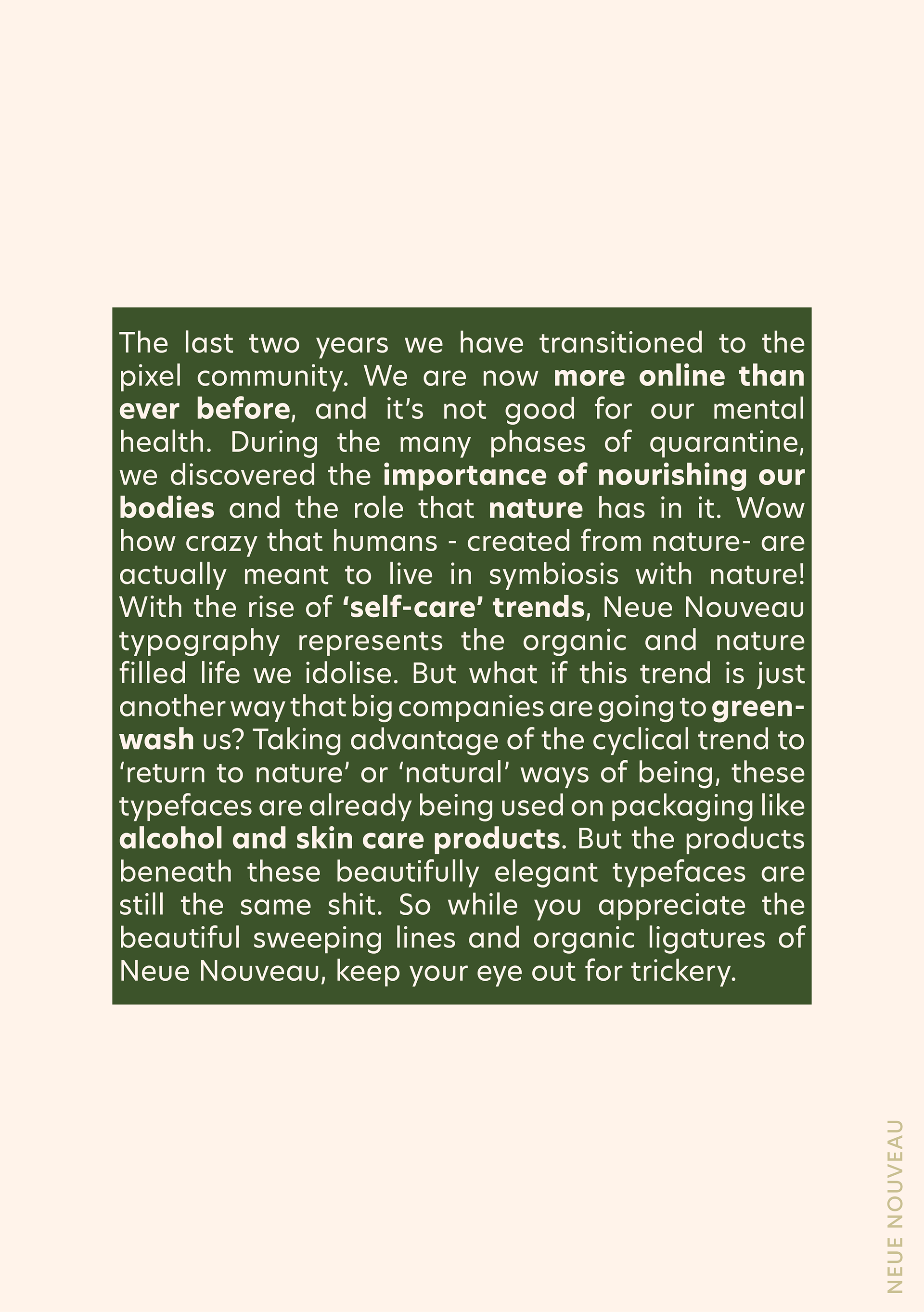
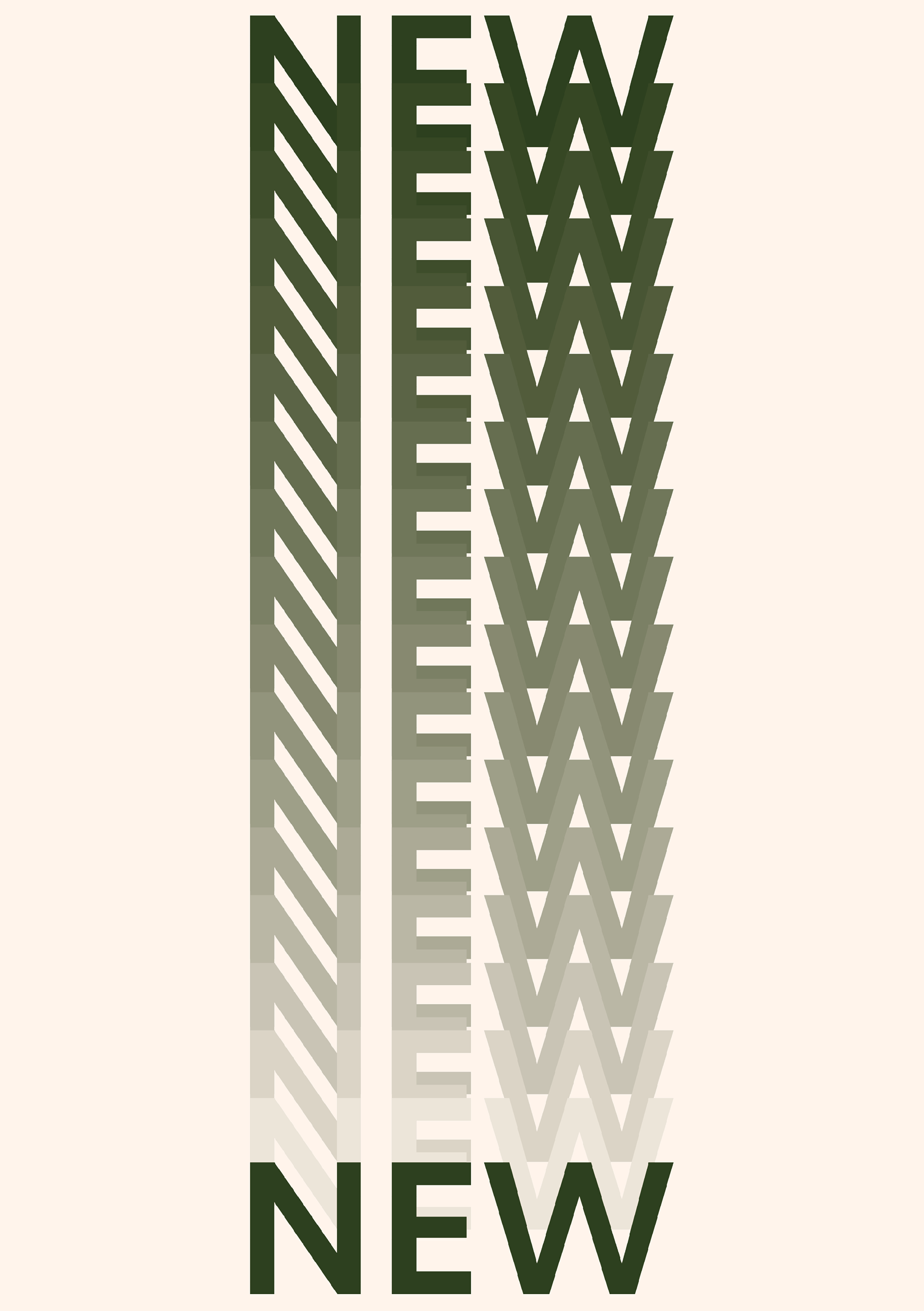
Typefaces
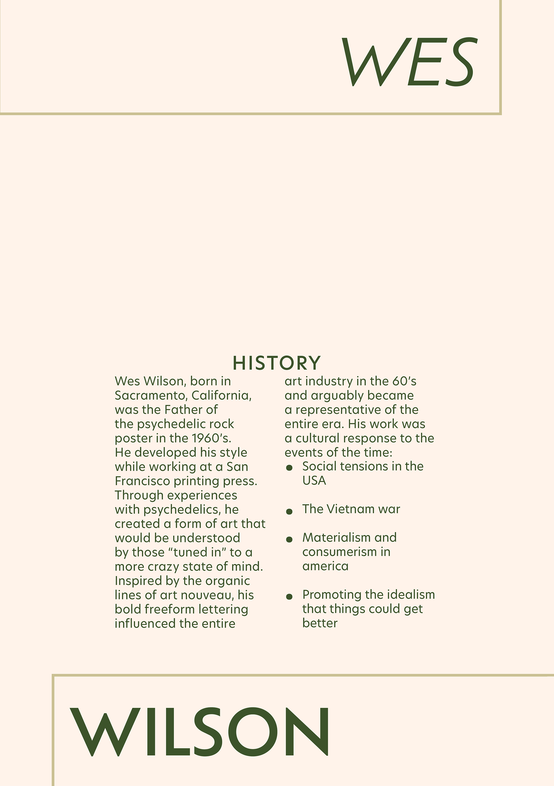
This publication uses a wide range of typefaces in order to exemplify the different typography trends covered throughout. The headings use Ofelia Display Bold, a sans serif typeface with a mix of geometric and humanist shapes. The main content such as body copy and subheadings are displayed in New Hero, a slightly humanist sans serif typeface. Humanist sans serif typefaces were chosen to establish readability at small sizes, and to incorporate the natural shapes of Neue Nouveau but in a modern way, suitable for a Zine.
Hierarchy
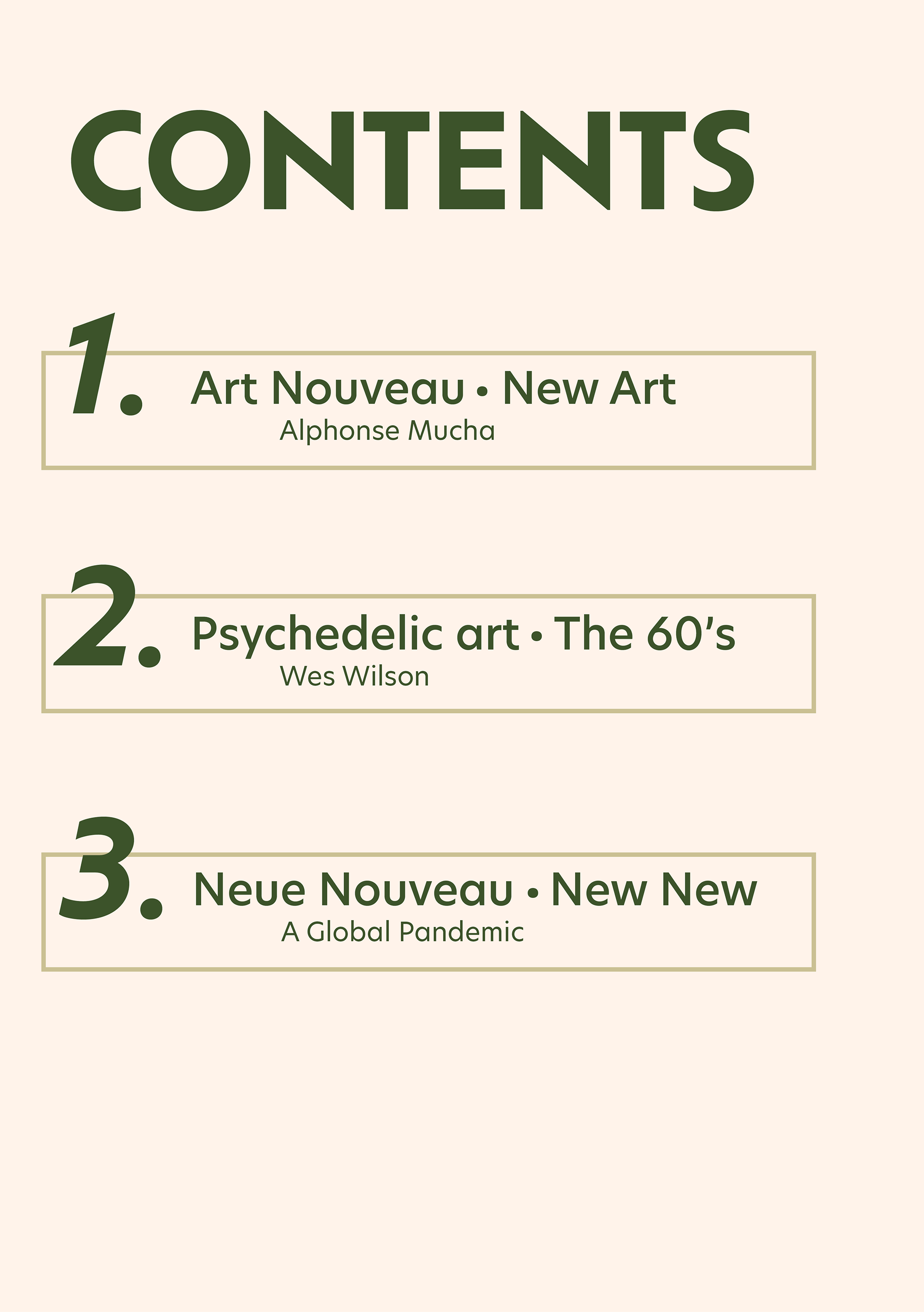
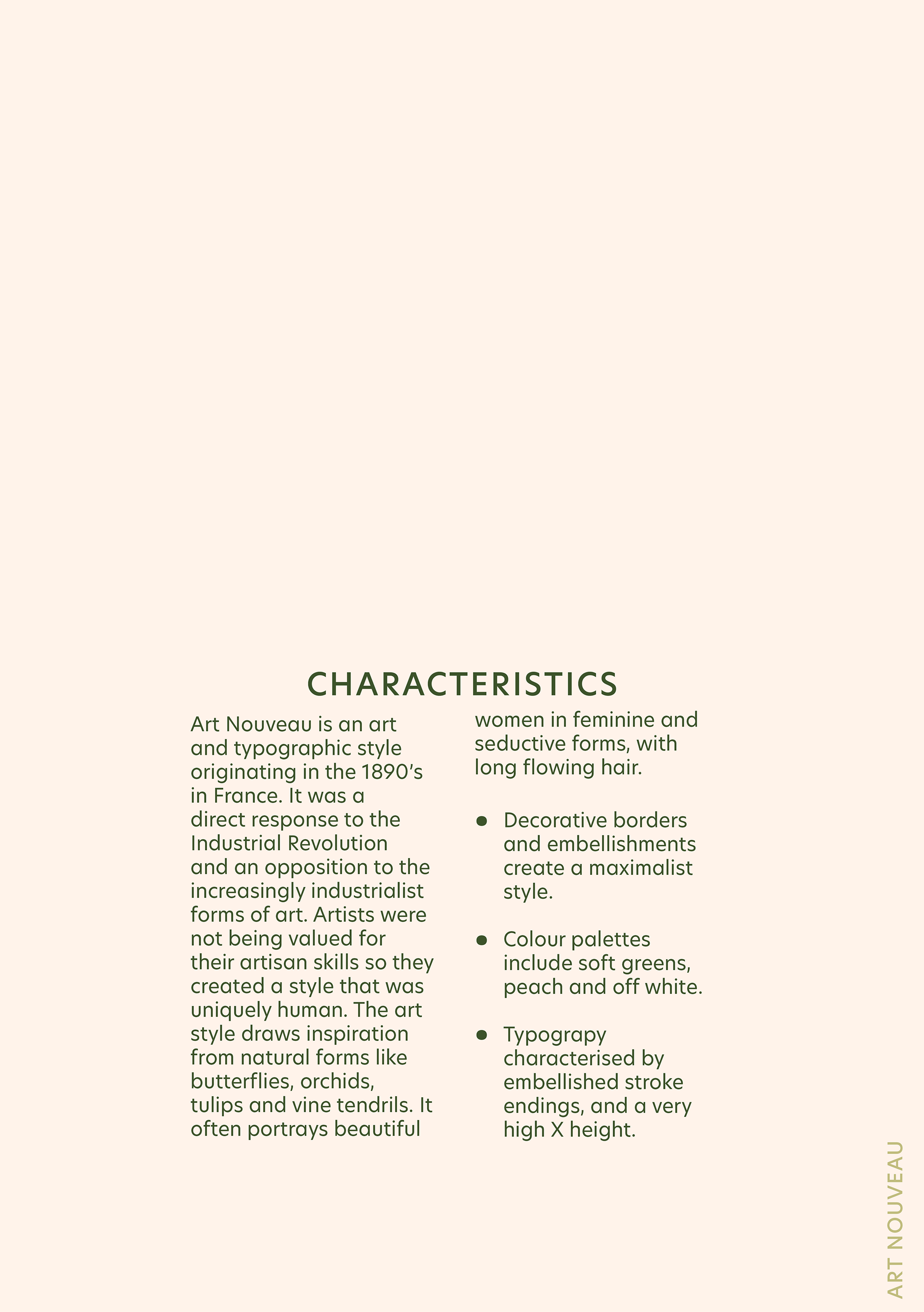
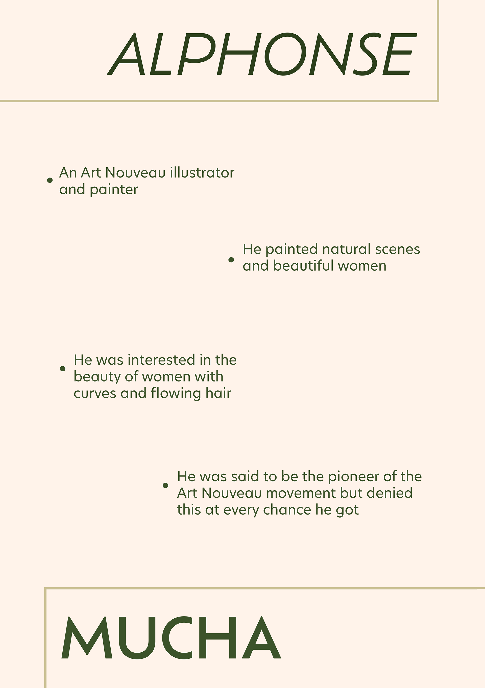
Hierarchy is established predominantly through the use of All Caps and text size. For example, all subheadings are in caps. ‘Chapter’ headings are in increased sizes to establish their hierarchy over the subheadings. To establish body copy, a smaller text size is used and text blocks are placed towards the bottom of the page - maintaining flow through a gravity effect. Text is predominantly centre aligned with some headings left or right aligned to establish dominance, and all folio content left aligned horizontally up the page to stay out of the main content.
Grid Layout
A 5 column grid layout is used (loosely) in this Zine to maintain flow and consistency throughout the document. The 5 column grid allowed use of many unique layouts, and often two or more columns were used at once. This grid can be shown in the body copy, which uses the middle two columns, and the details about Alphonse Mucha which are each aligned with a different column. A large margin borders the main content - the inner margin being equal to the outer margin as Zine’s are small paper print productions and do not lose space in the centre. This margin is shown through the use of large rectangles on the heading pages which are the size of the usable area with the margins.
Multi-page document Publication
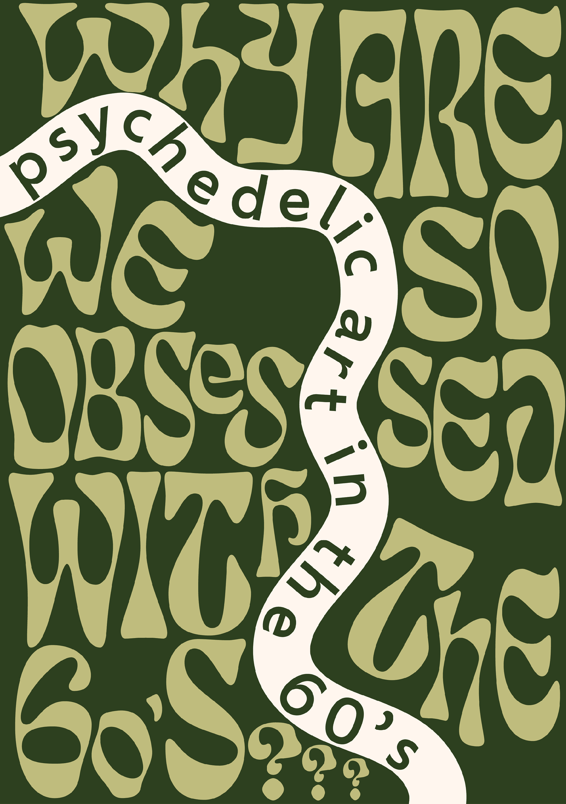
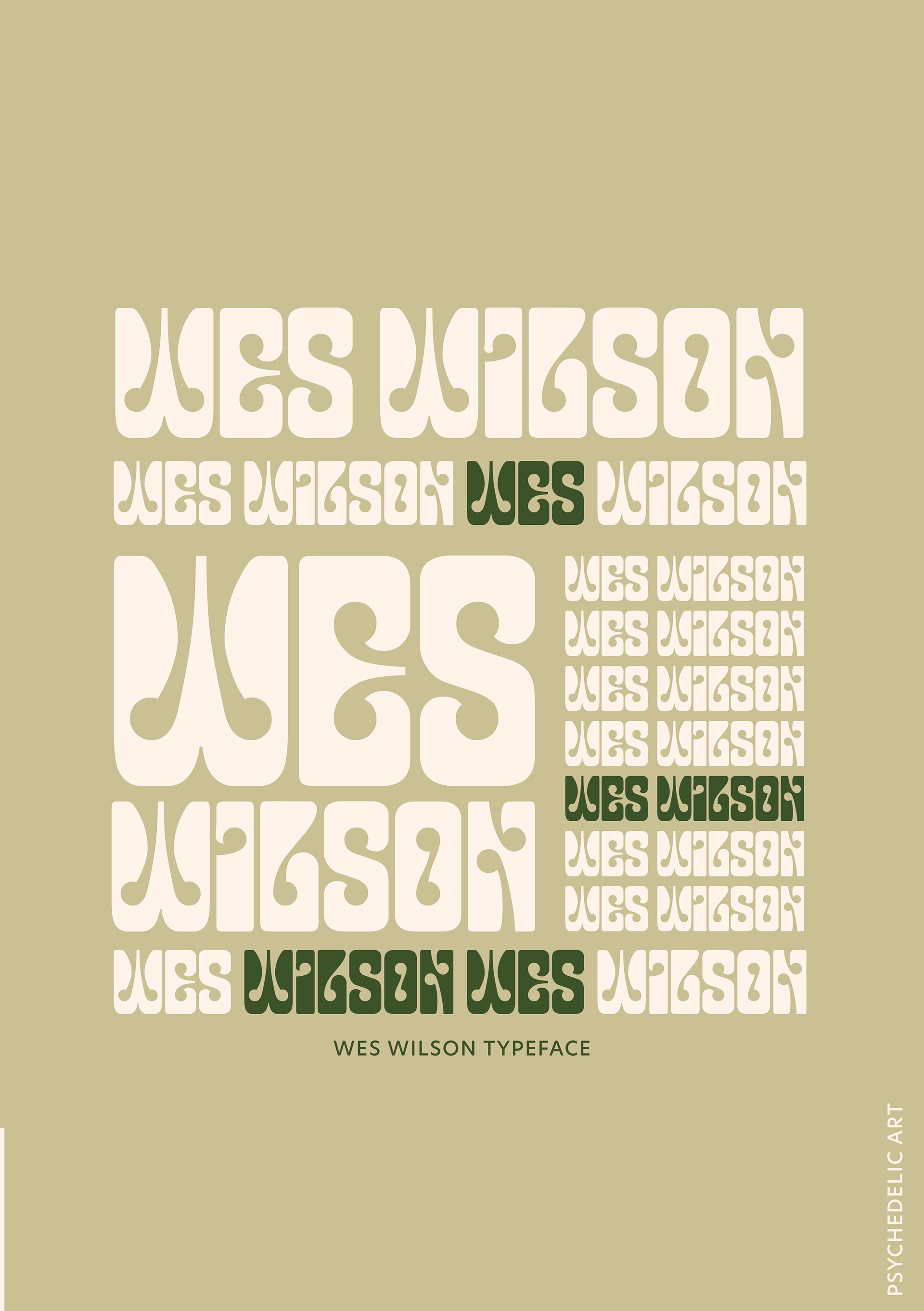
Content is organised chronologically throughout the document - telling the history behind the Neue Nouveau trend. To help tell the story, colour is used to differentiate between sections, with headers using the bolder - darker green. Images were not allowed to be used in the publication, however some artistic representations of type are used to help readers understand the text. For example the psychedelic art title page uses a psychedelic style of typeface in a moulded and mind bending way.
References
Nix, C., & Garnham, P. (2021). Type Trends 2022: Monotype (pp. 12–14).
The Editors of Encyclopedia Britannica. (2021a). Art Nouveau. In Encyclopedia Britannica. https://www.britannica.com/art/Art-Nouveau
The Editors of Encyclopedia Britannica. (2021b). Alphonse Mucha. In Encyclopedia Britannica. https://www.britannica.com/biography/Alphonse-Mucha
Wes Wilson. (n.d.). Smithsonian American Art Museum. Retrieved June 7, 2022, from https://americanart.si.edu/artist/wes-wilson-27389
