Week 8 - Label Critique and Design
Label Critique
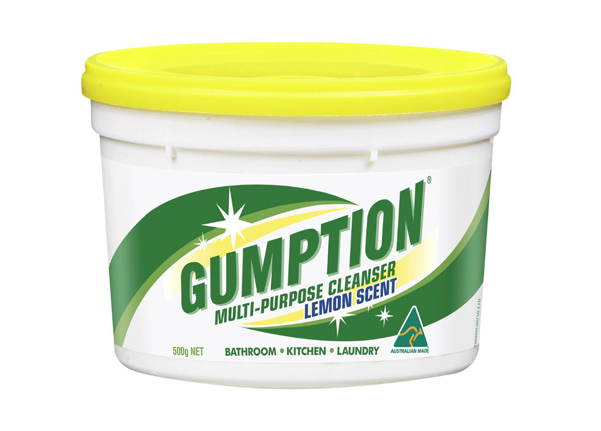
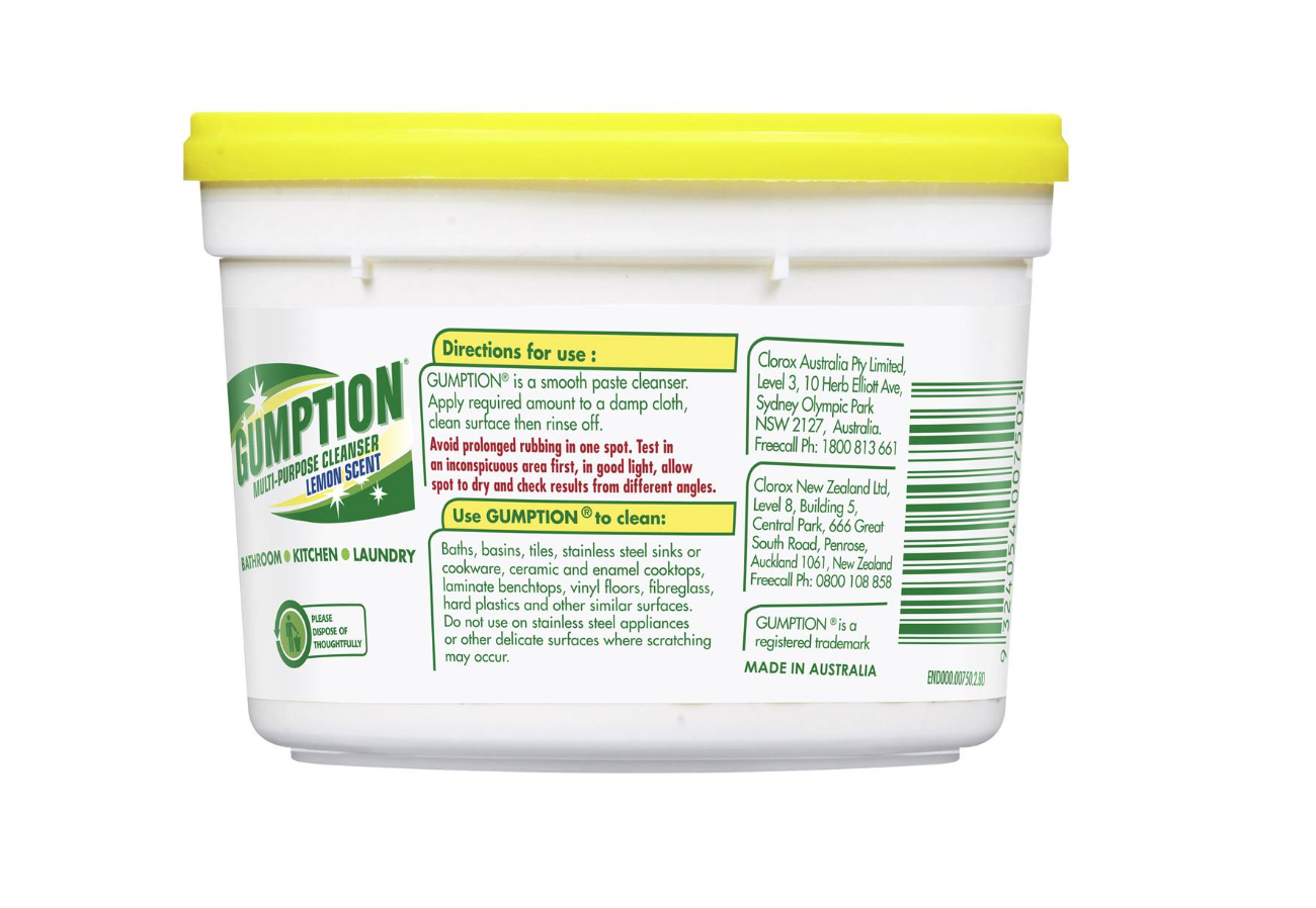
Gumption Paste is an all purpose abrasive cleaning paste. It is Australian made and advertises being non-toxic with no harsh chemicals or bleach.
How many typefaces were used?
- There are a total of 3 typefaces used in the label design, not including the generic numeral typeface included in the barcode.
What kind of typefaces are used and how do they relate to each other?
- The main typeface is used for the wordmark style logo.
- There is another typeface as a bold form in both regular and all caps that is used for descriptions and headings.
- The other typeface is used for copy text to describe the item and how to use it.
How did the designer use space and alignment to organise the text?
- All text is left aligned and with regular spacing
- The typeface has positive kerning and the words have heavy spacing
- This makes it very easy to read and a minimalist style
What were the treatments used to differentiate text and organise information — size, scale, treatment (colour, effects)?
- Keywords describing the uses of the product on the front label are in all caps form
- Visual hierarchy is used to convey importance
- The name of the brand is in all caps and at a larger size - followed by two lines that are a slightly smaller size
- Paragraph headings are symbolised through bold form type with a yellow background
- Safety information is in the colour red to stand out from the predominantly white, green and yellow design.
- The name of the product/brand is always formatted in all caps
What are the other elements on the label (logos, images, graphics, rules, background colours)
- A main logo
- Barcode
- End Code
- Dispose icon
- Australian Made logo
What is your opinion about the quality of the label? Does it work? Is it aesthetically pleasing? Is it effective? Why do you think that is?
- Although the colour options are garish and the use of shading in outdated. The overall design of this product label is very representative of the product is holds - a stong cleaning product. It has an almost swiss design aesthetic where less is more creating trust in the product. It does an effective job at allowing legibility through a sans serif font and furthermore readability through wide spacing and clear paragraph headings. The typefaces used are very non descript - in fact it is difficult to tell the difference between the two. For this reason I think that it is necessary to have two different typefaces and it would be more effective to use one type family and use different variations of it to create hierarchy.
How does the use of type and its organisation on the label influence the aesthetic quality and efficiency of this label?
- The minimalist typefaces have been paired with a simple and clean design which overall presents an aesthetic fitting to a cleaning product. In contrast to other cleaning products, this label is more effective in that it uses more negative space ans therefore would stand out from other cleaning products.
Label Design
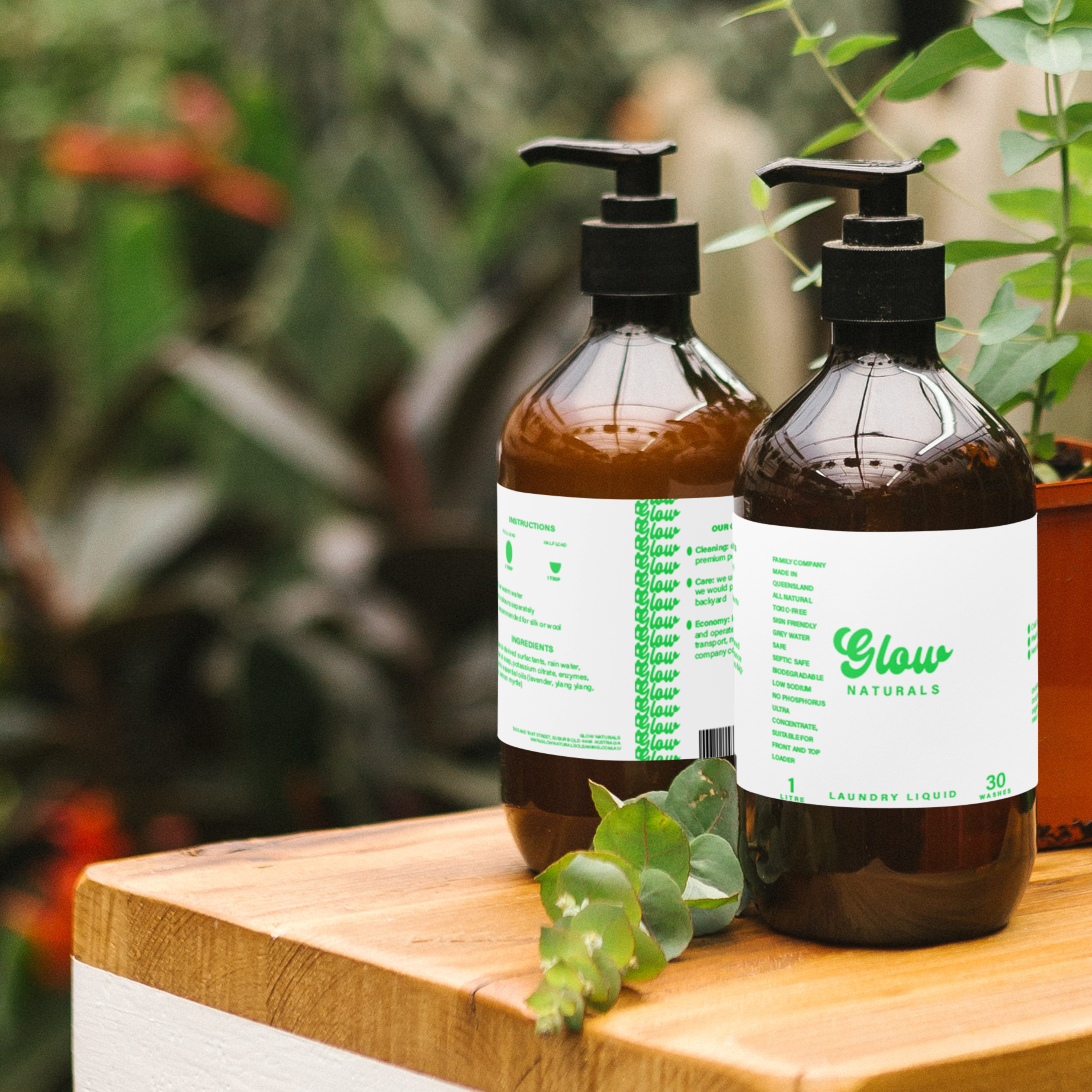
Design 1: 2 Typefaces and 1 colour
For this iteration I used the typefaces Classual and Acumin Variable Concept on a minimalistic white background in a neon green colour. I chose the thick and curvy display typeface Classual to contrast with the simple sans serif typeface that I used on the rest of the design. To create visual hierachy I used all caps bold for headings, all caps regular for semi important information such as the product type (laundry liquid) and then plain regular for all body text. To increase readability I increased the kerning on the all caps version of Acumin to +260.
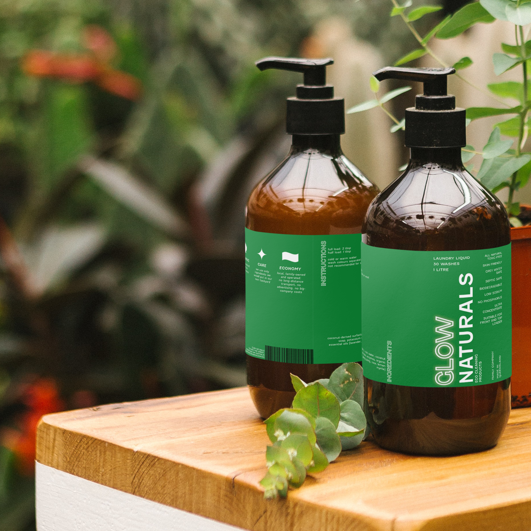
Design 2: 1 Typeface and 1 colour
For this iteration I used the typeface sans serif Fenwick as it has many weight variations and an outline variation. This allowed me to create visual interest and differentiation using only the one typeface. To play with the word 'glow' I added an outer glow to the typography. I could only use one colour so I chose to have this as the background to make the text 'glow' from the page. In this version I experimented with text orientation and setting to prioritise information, for example I kept the laundry liquid and 1L in left align so the information was highly readable, but allowed other less important info to be left align or up the page horizontally. Also, in the commitments section I used centre align to show the information was related to the headings above.
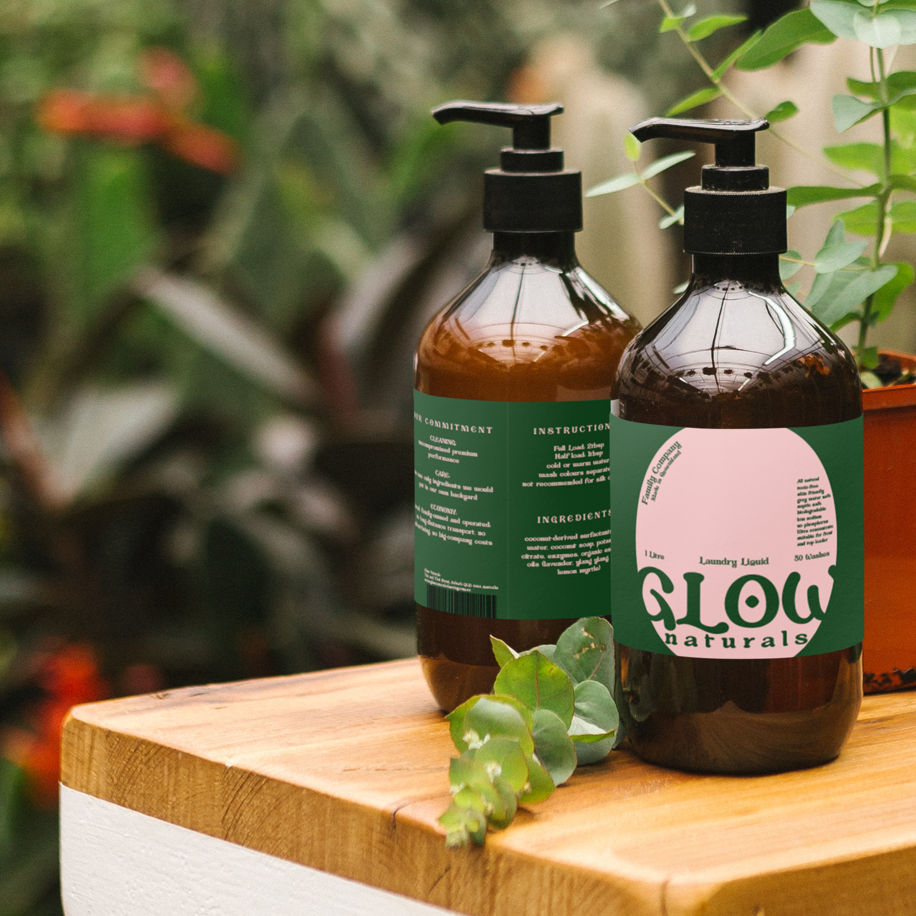
Design 1: 1 Typeface and 2 colours
Bottle Mockups
